TURNING MOMENTS INTO MEANINGFUL KEEPSAKE
A diary-inspired yearbook that captures student identity, shared moments, and the collective journey of a graduating cohort.
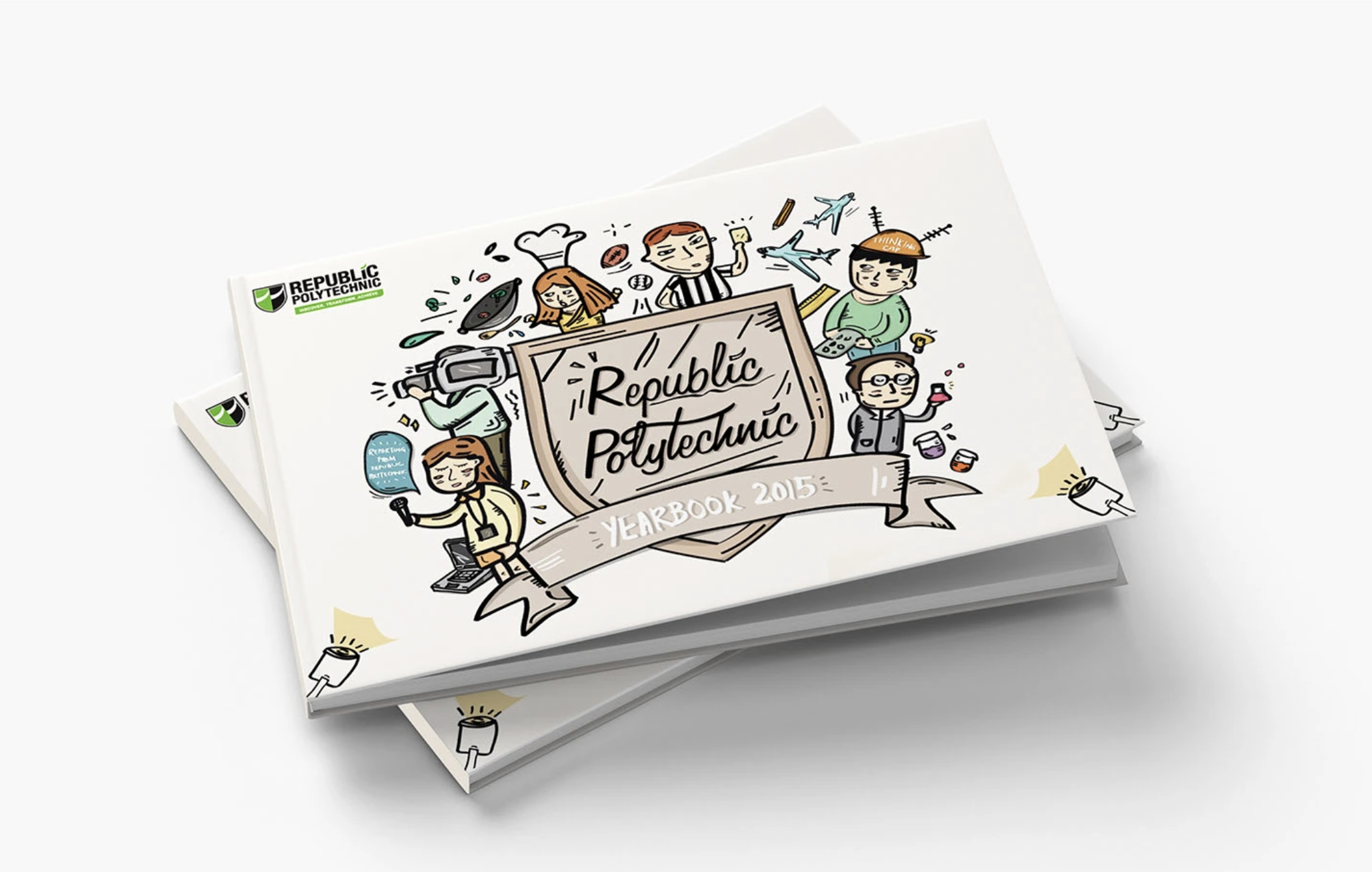
Republic Polytechnic’s yearbook is more than a printed artifact—it’s a collective memory of a cohort’s journey. The challenge was to design a yearbook that feels personal, relatable, and reflective of diverse student identities, while unifying different schools under one visual system.
Graduation yearbooks often become:
Visually templated and impersonal
Focused on documentation rather than emotional connection
Disconnected from how students actually remember their journey
How might we create a yearbook that feels like a personal keepsake, while representing the collective identity of an entire cohort?
CHALLENGES
Designing for Emotional Recall, Not Just Information
Instead of structuring the yearbook as a chronological record, the approach focused on how memories are experienced— fragmented, playful, and personal.
The design needed to:
Feel intimate and human, not institutional
Reflect individual identities, while still belonging to a larger cohort
Balance structure and spontaneity
THE STRATEGY
A Unified System for Diverse Identities
With multiple schools and disciplines involved, the challenge was to avoid fragmentation.
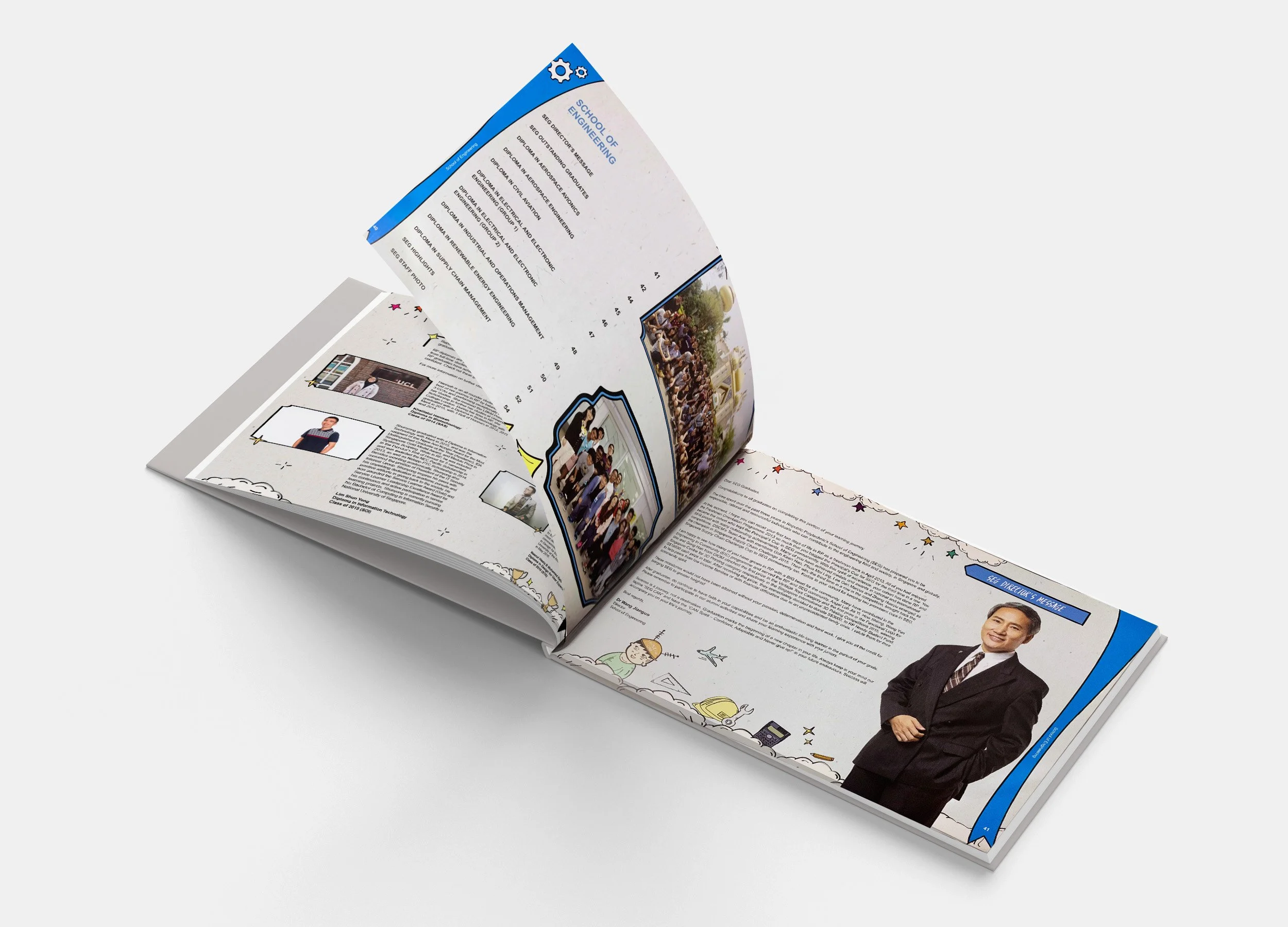
The solution was to create a modular visual system:
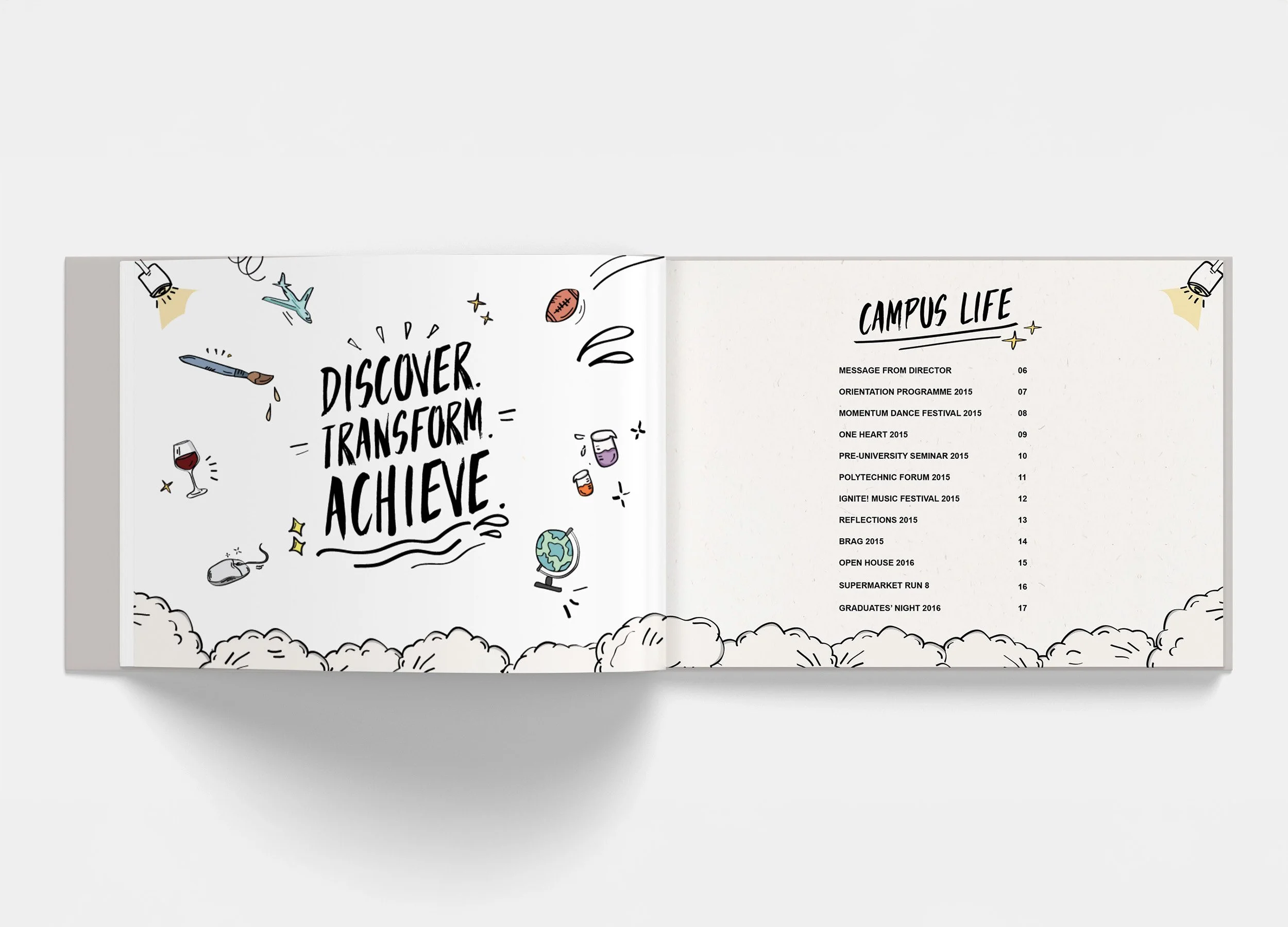
A consistent illustration style ties everything together
Course-specific elements personalise each section
A central visual language ensures cohesion across the book
DESIGN DIRECTION & VISUAL LANGUAGE
Diary-Inspired Narrative
The yearbook was designed to feel like a visual diary, using:
• Hand-drawn illustrations
• Playful compositions
• Organic placement of elements
This creates a sense of authenticity and informality, mirroring how students document their own experiences.
Illustration as Identity & Storytelling
Illustrations were not decorative — they function as storytelling devices.
• Each element represents different courses and student experiences
• Characters act as symbolic representations of different disciplines
• Small visual details (objects, icons, scenes) reflect everyday student life
On the cover, these elements come together around a central shield — a visual metaphor for individual identities forming a collective whole.
REFLECTION AND TAKEAWAYS
• Ground research is invaluable
Being onsite at MacRitchie revealed pain points and context that no desktop research could uncover.
• Designing for families requires dual empathy
Solutions must balance the needs, behaviours, and motivations of both parents and children.
• Tone of voice and illustration style matter
Branding and visual language can strongly shape engagement, especially for younger audiences.