AXS CHECKOUT
Improving AXS Checkout (online payment page) usability and features.
CLIENT: AXS Pte Ltd
ROLES: UI Design, UX Research
DURATION: 1 month
DESIGN BRIEF
I collaborated with two teammates to improve usability of the AXS online checkout experience across desktop and mobile, while also proposing relevant new features.
ABOUT AXS MERCHANT PORTAL.
AXS Checkout is the online payment checkout system used by AXS to enable customers to complete transactions on websites that integrate AXS as a payment method. As the final step in the payment journey, checkout plays a critical role in shaping user confidence and completion.
The goal of this project was to evaluate the existing checkout flow, identify potential sources of friction, and explore opportunities to improve usability without disrupting existing payment processes.
CHALLENGES
We set out to identify user needs and uncover friction within the AXS online checkout flow, understand what shoppers expect from a seamless checkout experience, and propose feature enhancements that directly address these gaps. To better understand where friction occurred and how it affected user confidence during checkout, we conducted user interviews and analysed common failure points in the existing flow.
SOLUTIONS
Based on research insights, the solution focused on creating a checkout experience that feels secure, transparent, and reassuring for users. Improvements were made to clarify payment details, strengthen visual trust signals, and refine confirmation moments to reduce uncertainty at key decision points.
By providing clearer breakdowns of charges, emphasising reliability through UI cues, and reinforcing confirmation states, the redesigned AXS Checkout supports users in completing payments confidently and efficiently.
METRICS
Usability testing was conducted on key checkout tasks, including reviewing order details, adding a promo code, selecting a payment method, switching between payment methods, and completing payment.
After iteration, users completed these tasks 86% faster on average, achieved a 100% task completion rate, and reported a 35% increase in perceived ease of use compared to the initial checkout flow. These improvements indicate a smoother, more intuitive checkout experience with reduced friction at critical decision points.
RESEARCH STRATEGY & FOCUS
We interviewed 9 tech-savvy users who regularly complete online purchases, reflecting AXS Checkout’s primary user group. These users were familiar with digital payment flows and able to clearly articulate moments of friction, hesitation, and trust during checkout.
The interviews focused on understanding how users perceived payment security, clarity of order information, and confidence during confirmation, as well as which features or signals would help them complete checkout more efficiently and with greater reassurance.
Across interviews, several recurring patterns emerged around trust, clarity, and efficiency during checkout.
PROBLEM IDENTIFICATION
From the research, three key themes consistently surfaced:
Security
HMW ensure the payment process feels reliable and stable from start to finish?
HMW visually signal that a website is secure and credible to reduce user hesitation?
Efficiency
HMW show users a clear breakdown of payment and order details so that they can trust the final amount before committing to pay?
Peace of mind
HMW enhance users confidence that their order is complete and their payment was successful?
These themes highlighted a core insight:
Online shoppers need a secure, transparent, and convenient payment experience that allows them to check out with confidence and peace of mind.
Based on these problem statements, we focused on designing checkout improvements that prioritised clarity, reassurance, and ease of completion at each step of the flow. These design decisions were translated into high-fidelity prototypes to demonstrate how the improved checkout experience works in practice.
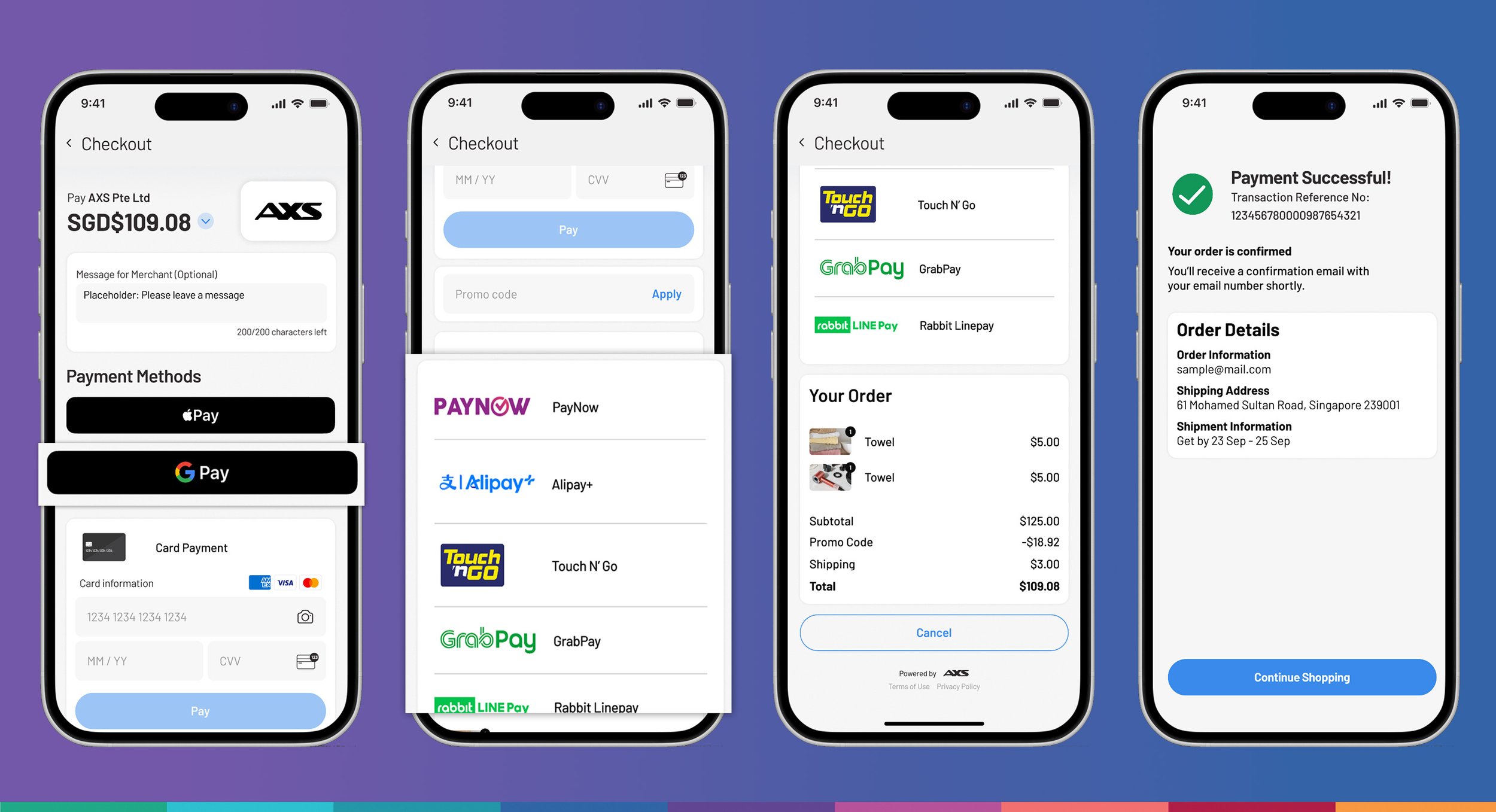
PROTOTYPE WALKTHROUGH
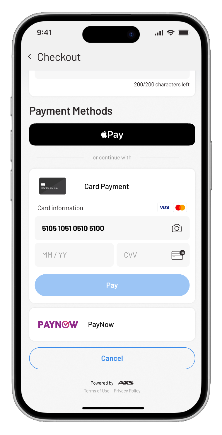
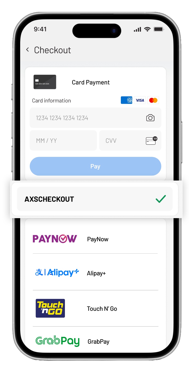
PAYMENT METHODS
USER INSIGHTS
• Credit cards & mobile wallets are most common, but users also rely on a wide variety of methods (including QR payments).
• Users citied that express checkout is a commonly used option to pay as it is quick and convenient.
• There was no back page from the PayNow option which left the user being stuck on that payment method and unable to reselect.
ITERATED
• Wider range of payment methods were added, such as Alipay for foreigners. Grabpay for users who are into collecting rewards.
• Introduce Google pay for android friendly express checkout.
• Display payment methods in an accordion format to reduce the need for toggling back and forth between pages.
• To reduce hesitation and increase confidence at the point of payment, we surfaced multiple payment methods earlier in the flow and clarified their availability.
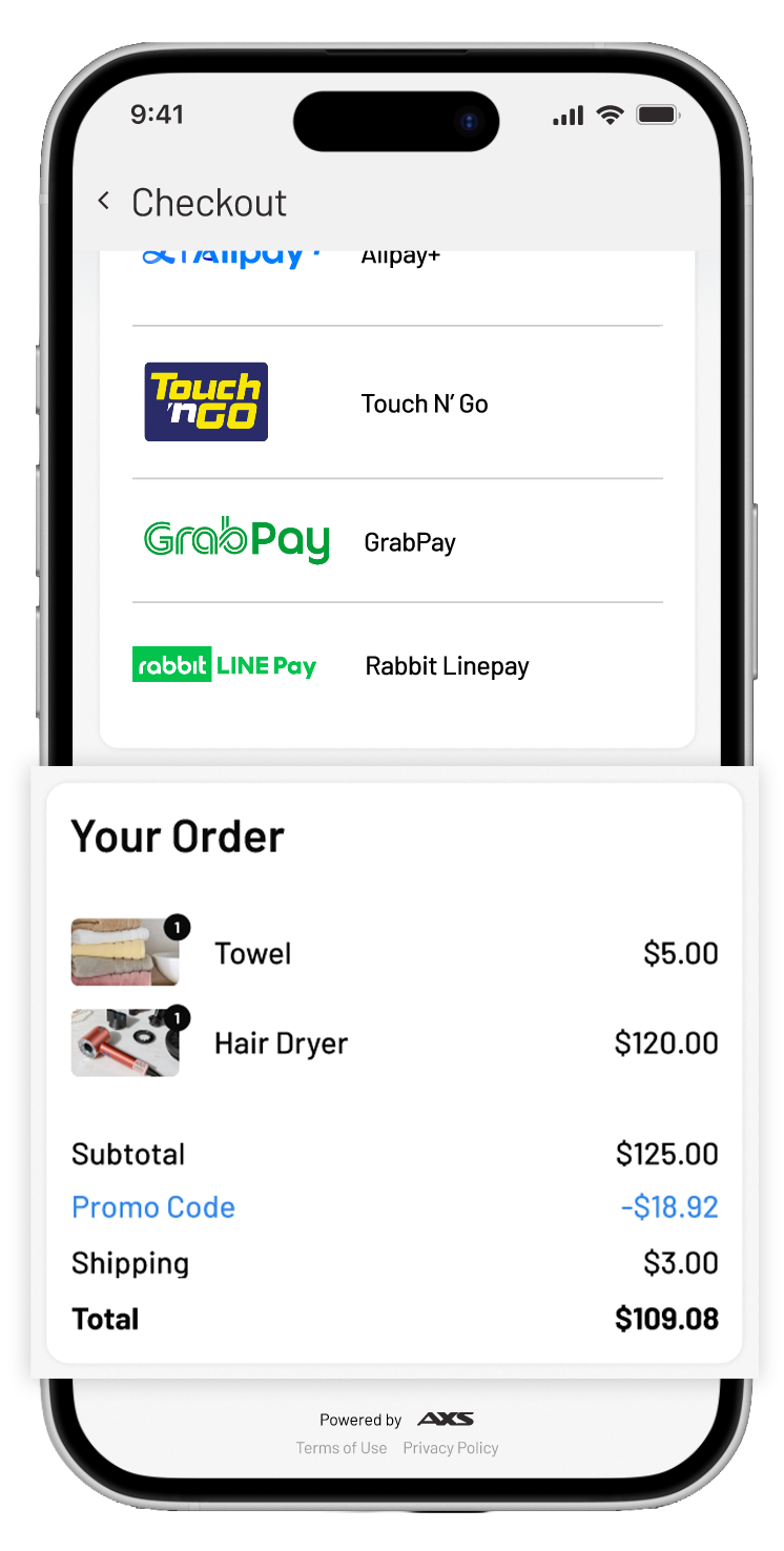
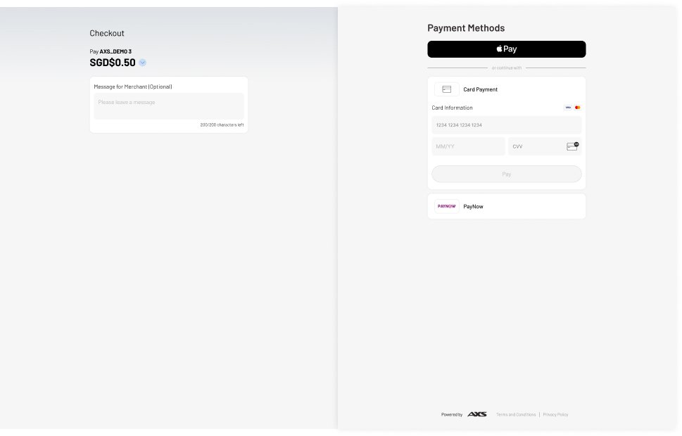
CHECK ORDER DETAILS
USER INSIGHTS
• During pre-checkout, users want a clear price breakdown, item quantity, taxes/extra charges, delivery address, and expected arrival date.
• 80% of users expect both clear on-screen confirmation and reliable email follow-up.
• E-receipts serve not just as proof of payment but as a trust-building and archival tool.
OPPORTUNITIES
• Pre and post breakdown of order details, including price, quantity of items and shipping information.
• Users can review and verify their entered details, especially their address and email.
PROMO CODE FILL
USER INSIGHTS
• 7 out of 9 users expect to see promo codes or vouchers available.
• Users felt a clear breakdown of promotional pricing would be useful.
OPPORTUNITIES
• Provide a promo code input field where users can enter discount or promotional codes.
• A green tick appears once the promo code is verified and usable.
• The promo code is reflected in the order details and highlighted in blue for clarity.
• Promotional amounts are highlighted in the price breakdown before checkout.
BEFORE
AFTER
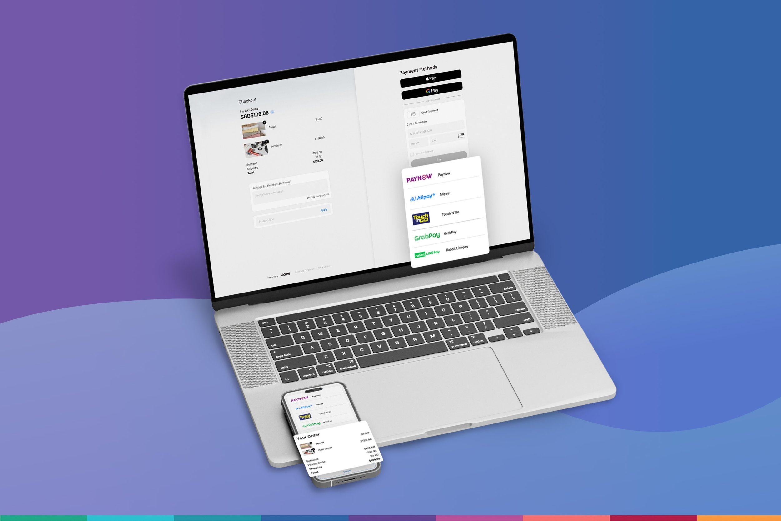
DESKTOP VIEW
BEFORE
• Limited order context
• Total amount lacks breakdown and reassurance
• Limited payment methods shown
AFTER
• Multiple payment methods are clearly listed and visually grouped
• Users can easily compare and choose their preferred option
• Accordion is introduced to reduce toggling between pages
Collectively, these changes aim to reduce friction at critical moments in checkout and support users in completing payments with confidence.
REFLECTION AND TAKEAWAYS
Designing for assurance matters
This project highlighted how important reassurance is at the point of payment. During usability testing, users frequently paused or double-checked information before proceeding. Introducing clearer confirmation states and visual trust cues in AXS Checkout helped reduce uncertainty and made users feel more confident completing their payments.
Small frictions compounds
Issues such as hidden price details or unclear breakdowns — had an outsized impact on the checkout experience. In AXS Checkout, these small points of friction slowed decision-making and increased hesitation. Addressing them collectively resulted in a noticeably smoother and faster checkout flow.
Clarity builds trust in payment
Improving the visibility of order details, fees, and payment status significantly changed how users perceived the checkout flow. In the redesigned AXS Checkout, clearer information reduced second-guessing and reinforced trust, showing that transparency is critical in high-stakes financial interactions.
Overall, this project reinforced the importance of designing checkout experiences that prioritise reassurance, clarity, and efficiency — especially at moments where users are making financial decisions.