TRANSLATING LUXURY BRANDS INTO EDITORIAL EXPERIENCE.
Bringing together editorial storytelling, visual direction, and digital brand experiences.
CONTEXT
uratedition was a branded content platform — the kind that sits between editorial and advertising, where the content has to work as genuine reading material first, and as brand communication second. The moment a luxury reader senses they're being sold to, you've lost them.
My role was to develop the visual concept, photography direction, and art direction for each brand collaboration, working across a roster of clients whose audiences had very different styles, aesthetics, and levels of brand literacy. I also attended PR and media events, created event content, and captured behind-the-scenes coverage during photoshoots, extending the brand narrative across from physical to digital touchpoints.
Role: Visual Communication, Art Direction
Deliverables: Editorial Concept, Social Media Assets
CONTENT FOCUS
-
Bottega Veneta
Audience: Design-literate, Chic, Unconventional.
Editorial approach that matched the brand's understated confidence.
-
Lancôme
Audience: Women who identify with confidence and on their own terms at different stage and age.
Advocacy and awareness campaign. Photography-led, emotionally resonant.
-
DBS TwentyxThirty
Audience: Millennials approaching marriage.
Three-part content series on jewellery buying and financial decisions. Elegant with a light editorial touch.
THE APPROACH
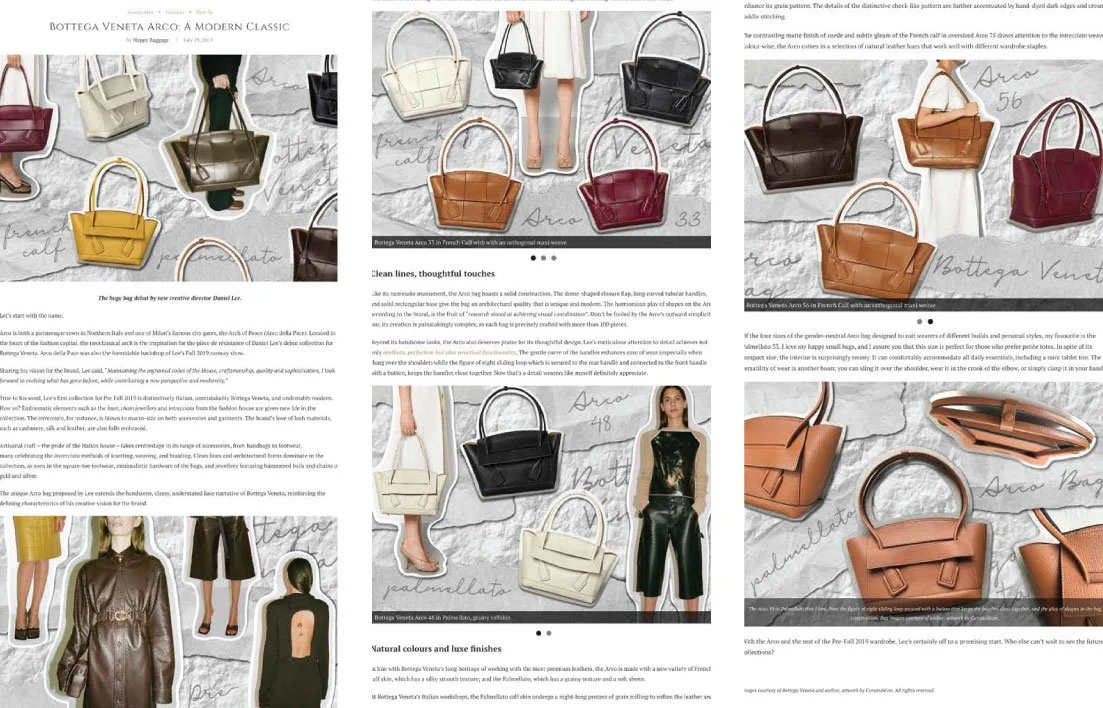
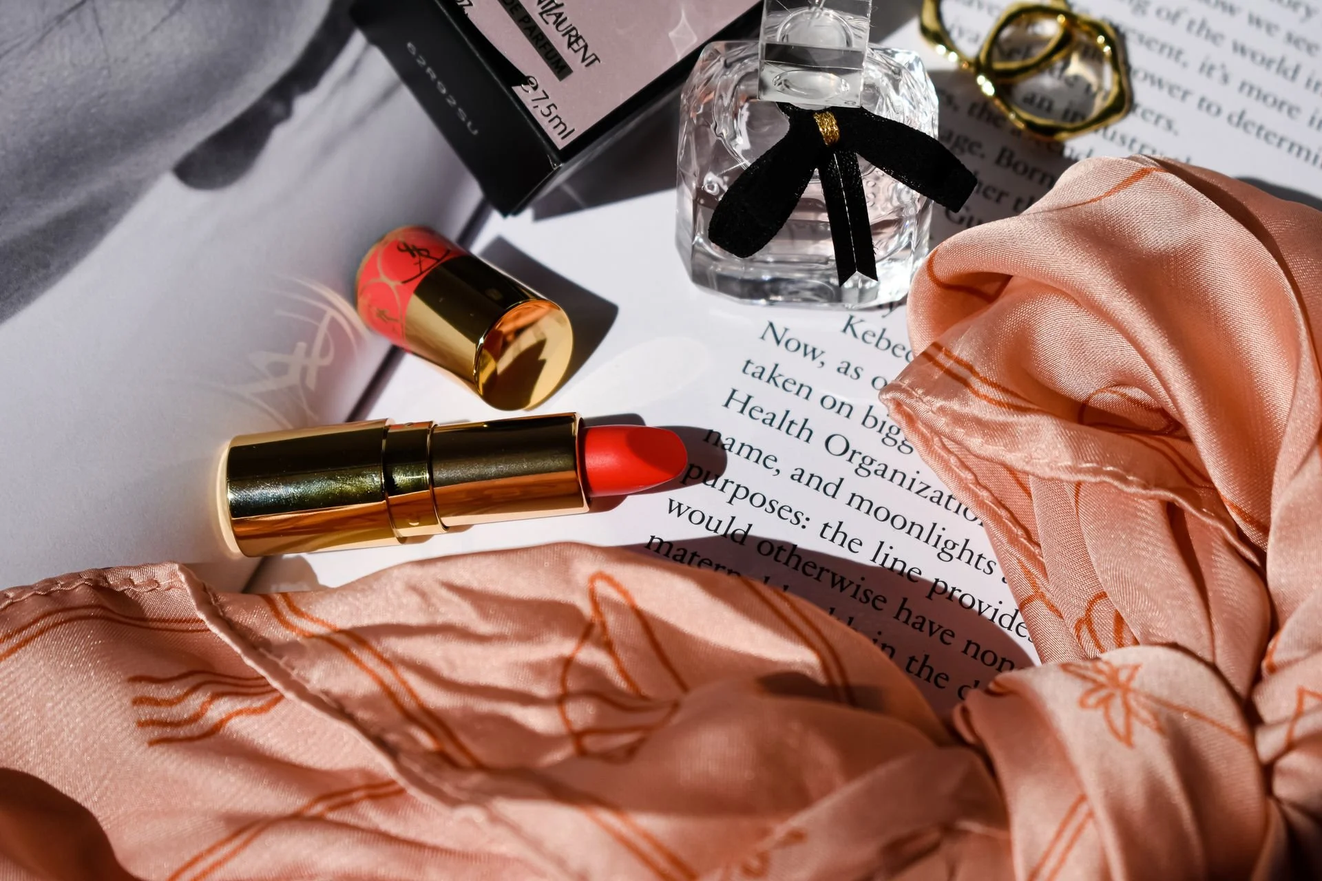
BOTTEGA VENETA
The collection’s design language is architectural and quiet. I chose a deconstructed flatlay style — products cut out and layered against a textured stone-effect background with handwritten brand references. Modern, editorial, anti-catalogue.
The editorial article focused on showcasing the new arrival collection while maintaining the understated sophistication associated with the brand. Instead of relying on heavy graphics, I explored a deconstructed flatlay style with layering textures, cut-out compositions, and handwritten typography. Utilised muted tones to create a modern editorial feel that still felt luxurious.
I approached the visuals almost like constructing a fashion moodboard — allowing the products to remain the hero while creating a visual rhythm that guides readers through the article naturally.
The audience for Curatedition’s luxury content was highly visual and trend-aware, so maintaining a balance between elegance and contemporary digital aesthetics became an important part of the creative direction.
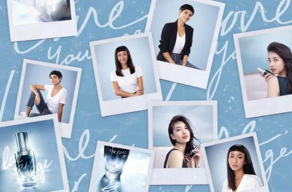
LANCÔME
The Laneige campaign leaned much more into social and digital interaction.
The visual direction was inspired by Laneige’s signature blue palette and youthful skincare positioning. I experimented with layered polaroid-style photography, handwritten typography, soft gradients, and motion-based GIF content to make the campaign feel more conversational and social-first.
Beyond the editorial layouts, I also created Instagram GIF assets to support engagement and extend the campaign onto social platforms. Since audiences were consuming the campaign through both articles and social media, the visuals needed to feel cohesive while adapting naturally to different formats and attention spans.
This project taught me how important motion, pacing, and platform behaviour are when creating content for digital audiences.
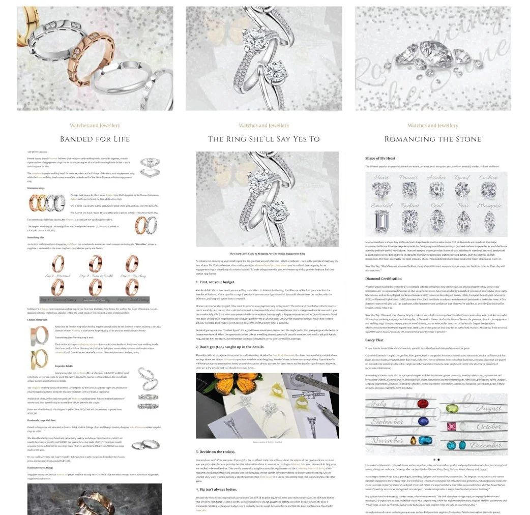
DBS TWENTYXTHIRTY
This collaboration with DBS TwentyXThirty focused on millennials navigating relationships, weddings, and financial decisions.
Rather than approaching the content from a purely banking or financial angle, the storytelling centred around lifestyle aspirations, emotional moments, and practical guidance. My role was to shape the visual language of the editorial content in a way that felt elegant, digestible, and relatable to younger audiences.
I kept the layouts minimal and refined, using soft neutral palettes, sparkly textures, and clean compositions that allowed the jewellery and written content to stand out without feeling overly commercial.
The project reinforced how visual storytelling can help simplify information-heavy topics while still creating an emotional connection with readers.
Social Campaign Highlights
Bringing campaigns to life through bite-sized animated content designed to capture attention, communicate quickly, and drive engagement across social platforms.