DESIGNING SEASONS INTO EXPERIENCES
Creating identities that balance brand storytelling, customer engagement, and in-store communication.
THE CHALLENGE
Brotzeit runs five distinct seasonal campaigns a year. Each one has its own menu, its own mood, its own reason for existing. The brand needed each campaign to feel fresh and thematically distinct — while still reading as unmistakably Brotzeit across every single touchpoint, from an in-store wall mural to an Instagram story.
STARTING WITH RESEARCH
Before I touched any visual, I spent time understanding how people actually moved through a Brotzeit experience, both in-store and digitally. I looked at where engagement dropped, what content performed, how customers responded to different seasonal themes in previous years.
The real friction wasn't visual inconsistency. It was that each campaign was being communicated as a separate event, rather than a continuous brand experience with a seasonal chapter.
That reframe changed everything. Instead of designing five campaigns, I was designing one brand system with five seasonal expressions.
WHAT I OBSERVED
In-store customers often missed campaign context. They will see a seasonal menu item without understanding the story behind it.
WHAT I OBSERVED
Digital assets and print collateral often felt disconnected, same campaign, different energy.
WHAT I CHANGED
Campaign key visuals were built to carry narrative — the logo, the colour, the typography all told the seasonal story before a word was read
WHAT I CHANGED
I built each campaign from the key visual outward, so every format, from poster to EDM — was a translation of the same core visual idea, not a separate design.
Every design decision had a reason rooted in audience behaviour or cultural context. Nothing was chosen because it looked good. It was chosen because it said something.
HOW I APPROACHED EACH SEASON
Every campaign started with a core question: what does this season actually mean to the people who come to Brotzeit? Not what does it mean generically, but what does it mean in the context of sitting down with friends over German food in Singapore?
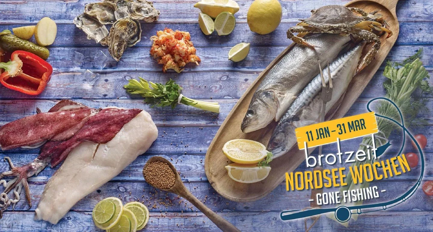
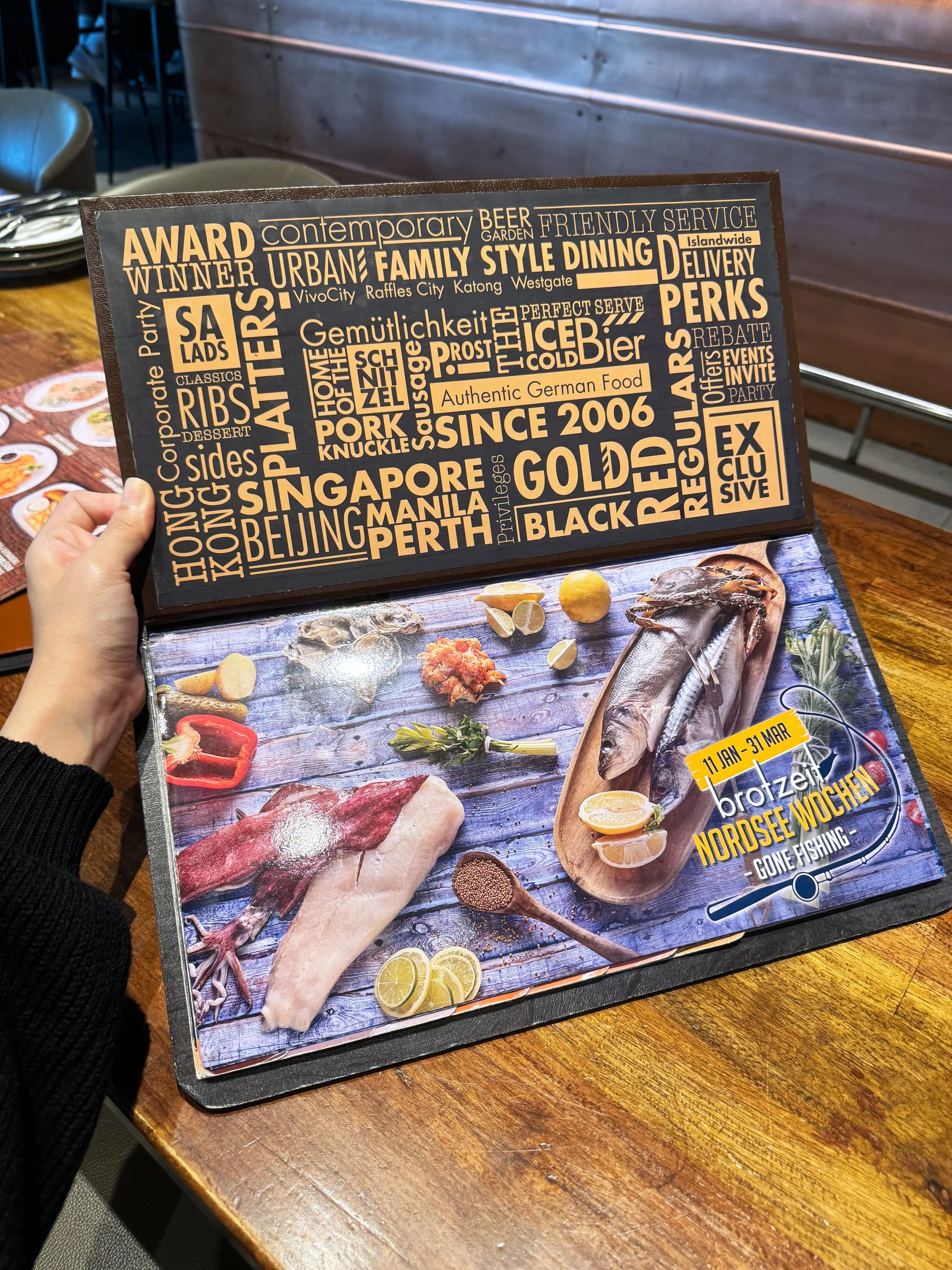
For Nordsee, the answer was authenticity and provenance. The feeling of a meal that came from somewhere real. That's where the blue textured aesthetic came from; not just "ocean," but the roughness of a coastal experience translated into colour and texture.
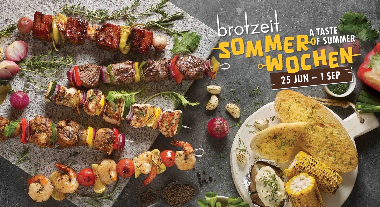
For Summer (Sommer Wochen), the insight was more playful. The centerpiece was skewers, so I made the typography itself the skewer. The letters became the food. It was a small conceptual move, but it meant the logo communicated the campaign's entire spirit without needing any supporting copy.
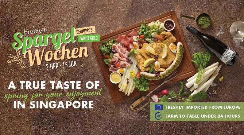
The Spargel (white asparagus) campaign took a lighter and fresher direction. White asparagus is strongly associated with spring in Germany, so the design language shifted towards earthy greens with warm and soft neutral textures. The goal was to make the campaign feel lighter, healthier, and more premium — mirroring the ingredient itself.
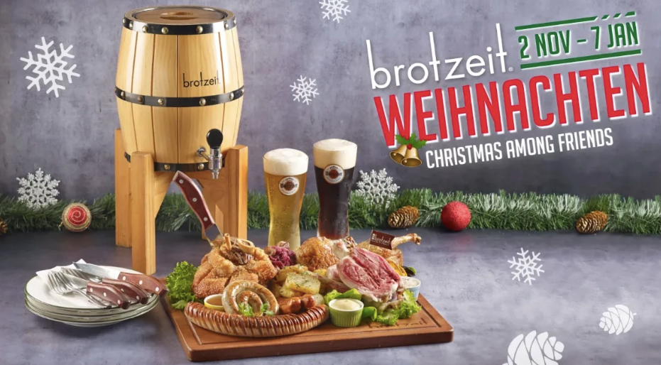
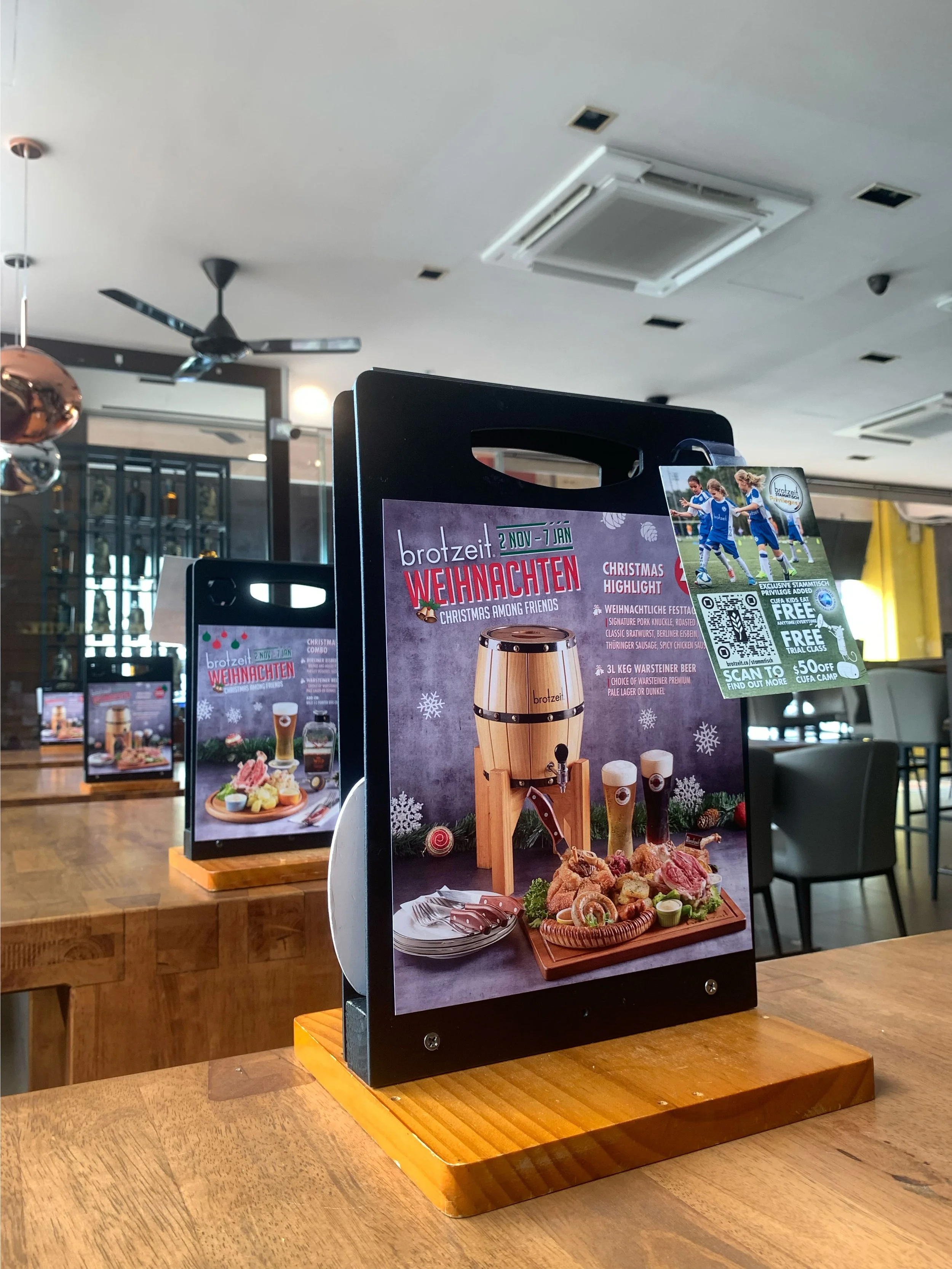
Christmas campaigns focused more on emotional warmth and communal dining. The colour direction leaned heavily into festive reds and greens with warm wood textures. The objective wasn’t simply to look “Christmas-themed”, but to create a sense of gathering and celebration.
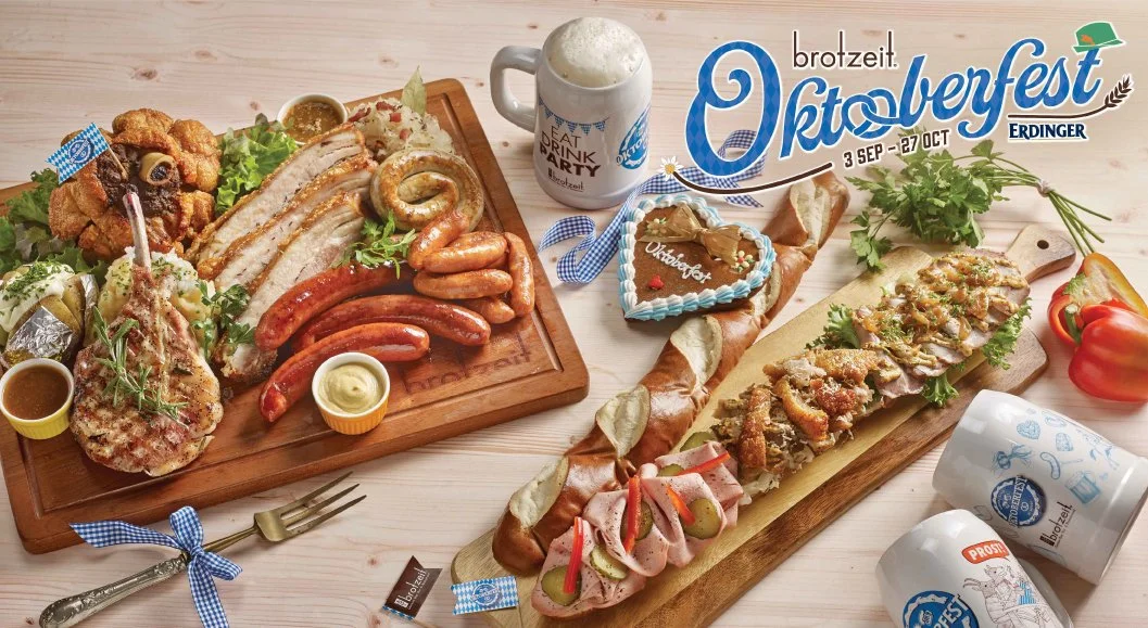
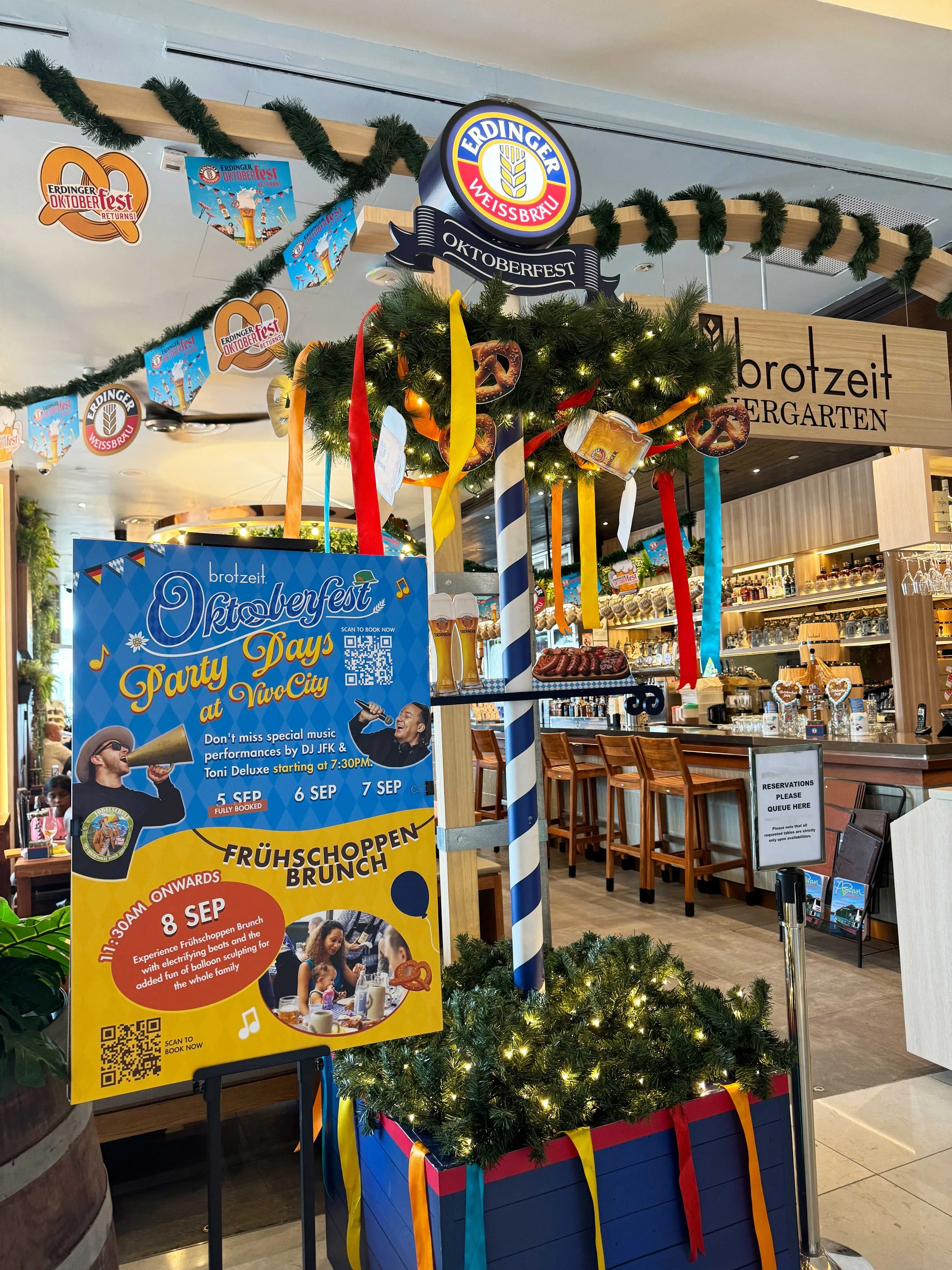
Oktoberfest campaigns carried a much louder and more energetic tone. The visual system leaned into bold typography with Bavarian-inspired cues. Oktoberfest visuals were intentionally more crowded and vibrant to mirror the atmosphere of celebration, noise, and abundance associated with the festival.
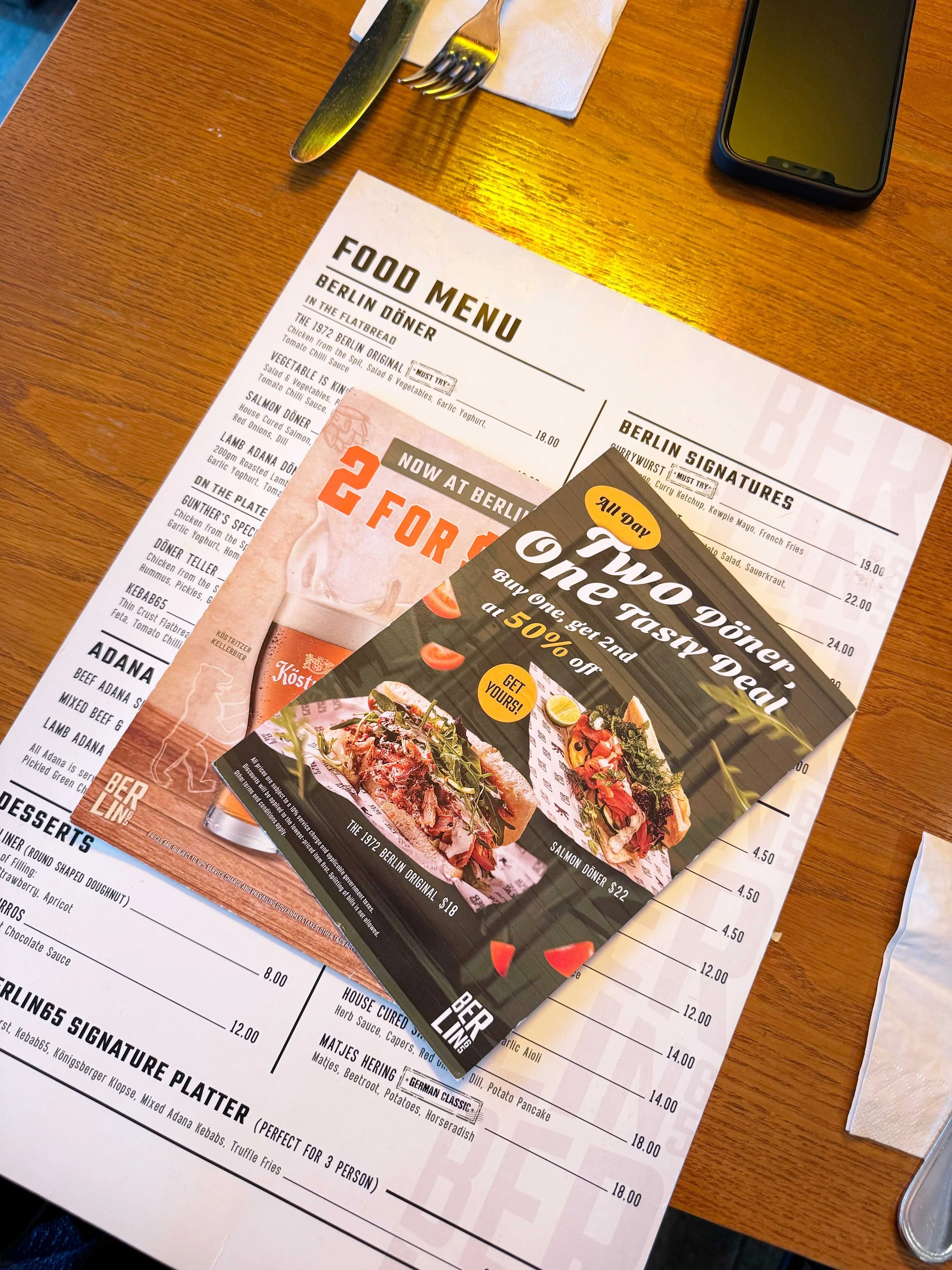
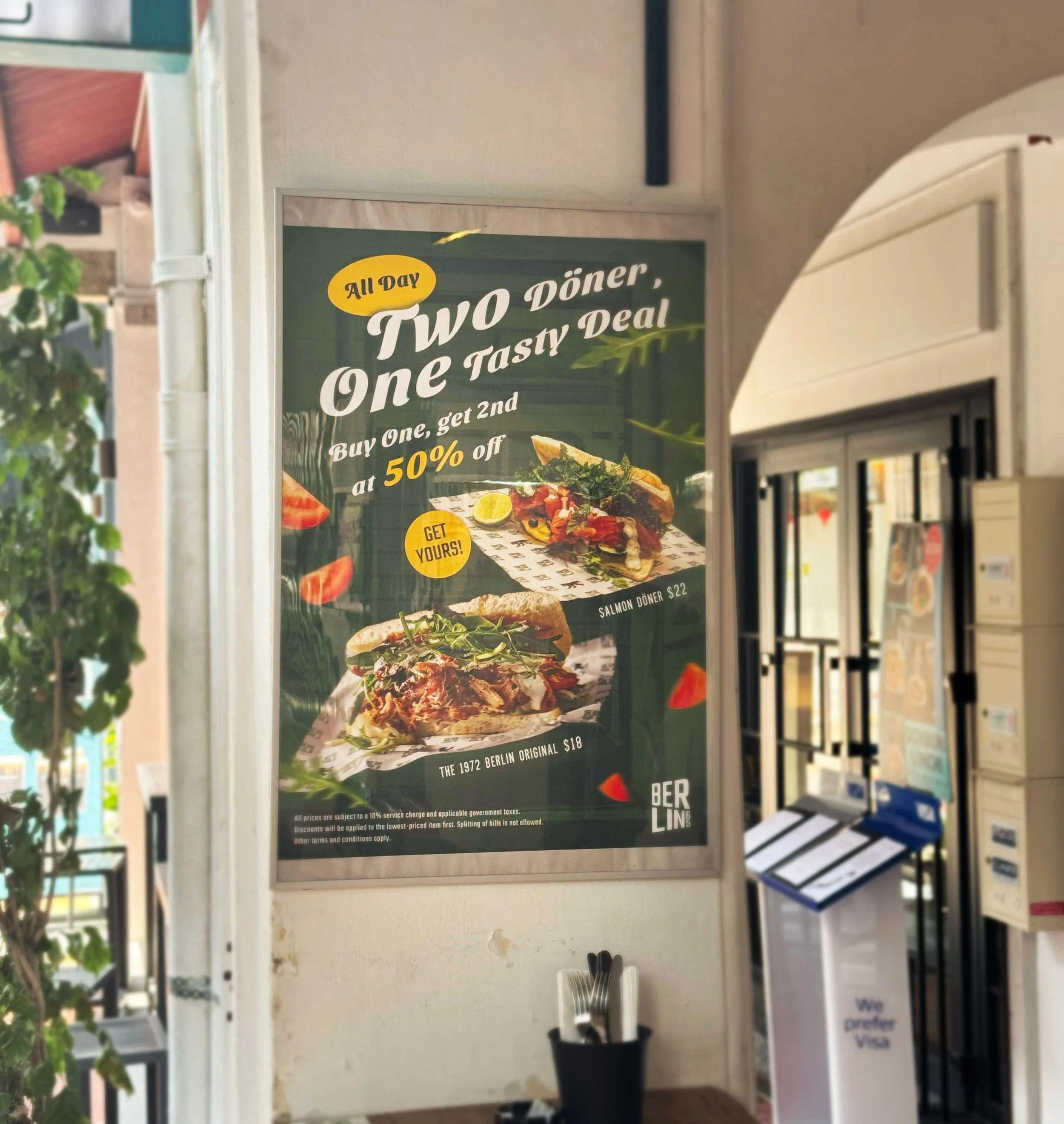
WHAT GOT PRODUCED
-
Print
Table cards, posters, wall murals, menus
-
Digital
Social assets, TV displays, EDM (weekly)
-
Branding
Seasonal logos, key visuals, campaign identity
BERLIN65
Beyond the seasonal campaigns, I also led the communications identity for Berlin65 — a sister brand targeting a distinct, younger audience. That project required a completely different strategic lens: understanding a new customer segment, doing cultural research on Berlin's identity, and building a brand from scratch with its own visual language that wouldn't be confused with Brotzeit's.
RESEARCH — UNDERSTANDING BERLIN
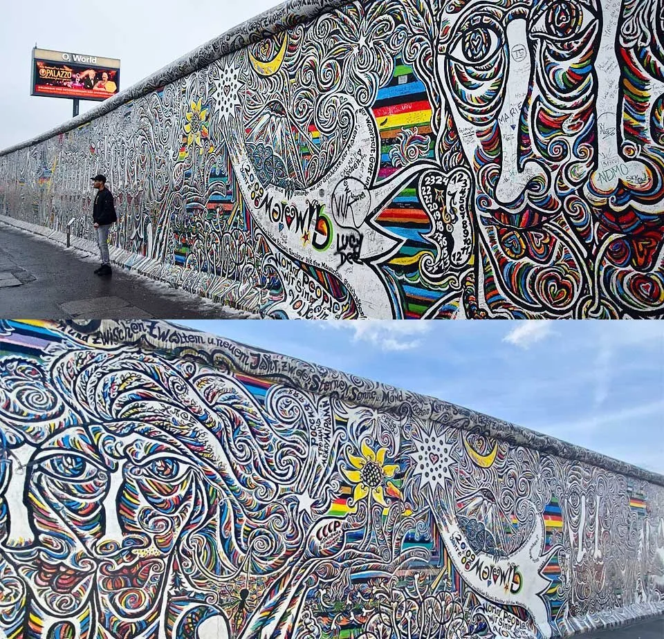
Before I sketched anything, I went deep into what Berlin actually means as a cultural reference. Not the postcard version but the real texture of the city. I looked at Berlin's street culture, its design history, its attitude. What kept coming back was one thing: the Berlin Wall.
Not as a symbol of division, but as a canvas. The Wall became the world's longest open-air gallery — a surface where identity, protest, and creativity all collided in the same space. That felt like exactly the right cultural anchor for a street food brand that was about mixing influences and doing things differently.
The graffiti culture of Berlin isn't decoration. It's communication — raw, direct, and unapologetic. That became the strategic lens for the entire identity.
CREATIVE DIRECTION AND STRATEGIC DECISIONS BEHIND THE LOGO
The stacked letterform. "BER / LIN" split across two lines — referencing the physical structure of the Wall itself.
The colour: green. Not chosen for aesthetics alone. Green signals freshness, which directly references the food proposition. It also offers a refreshing visual contrast to Singapore's saturated F&B landscape, most of which leans warm.than magical. The challenge became:
The typeface weight. Heavy, condensed, industrial. Drawn from the visual grammar of Berlin's street signage and graffiti letterforms. Bold enough to hold its own on menus, packaging, and outdoor applications.
CREATIVE DIRECTION FOR FOOD MENU
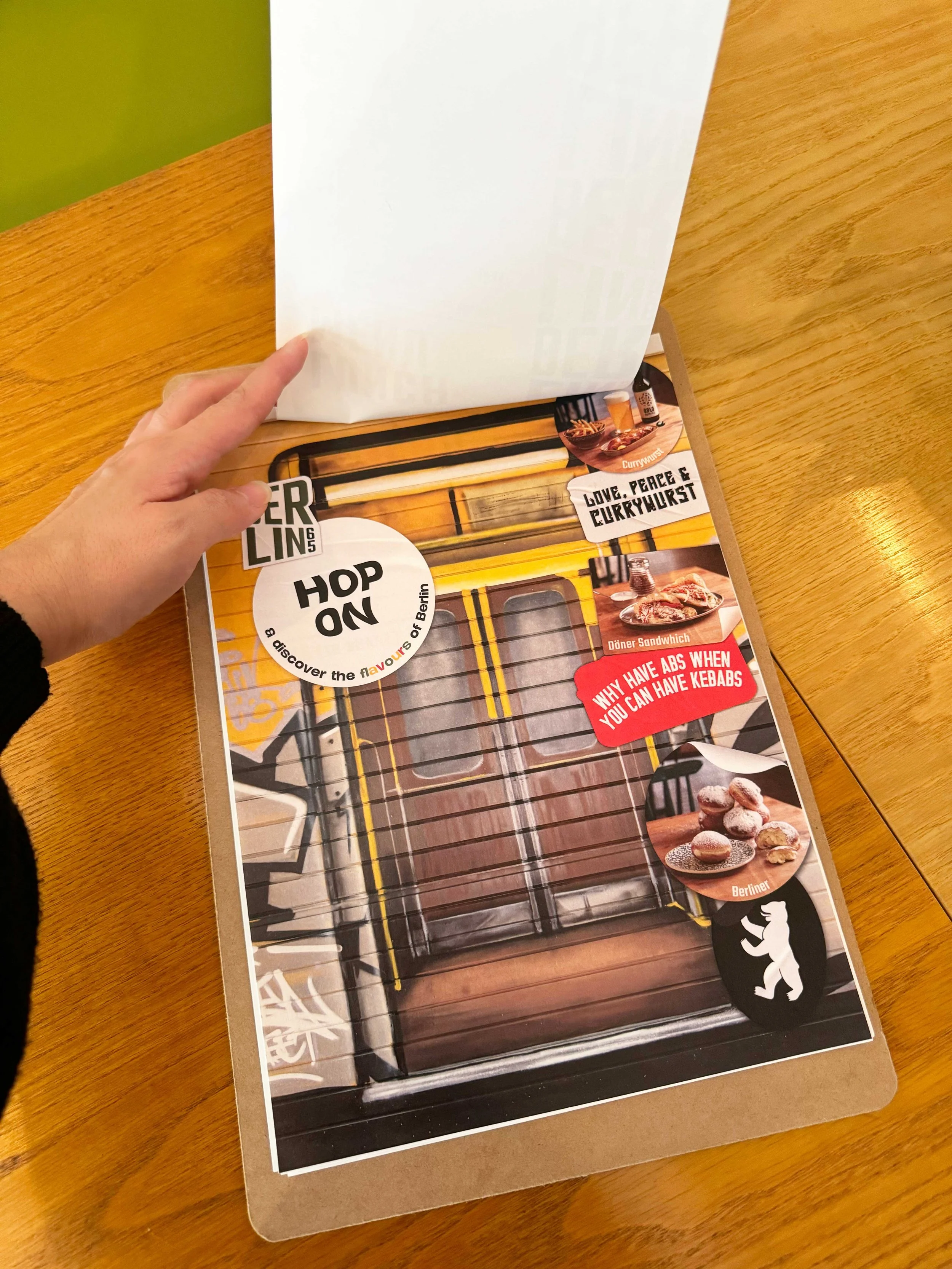
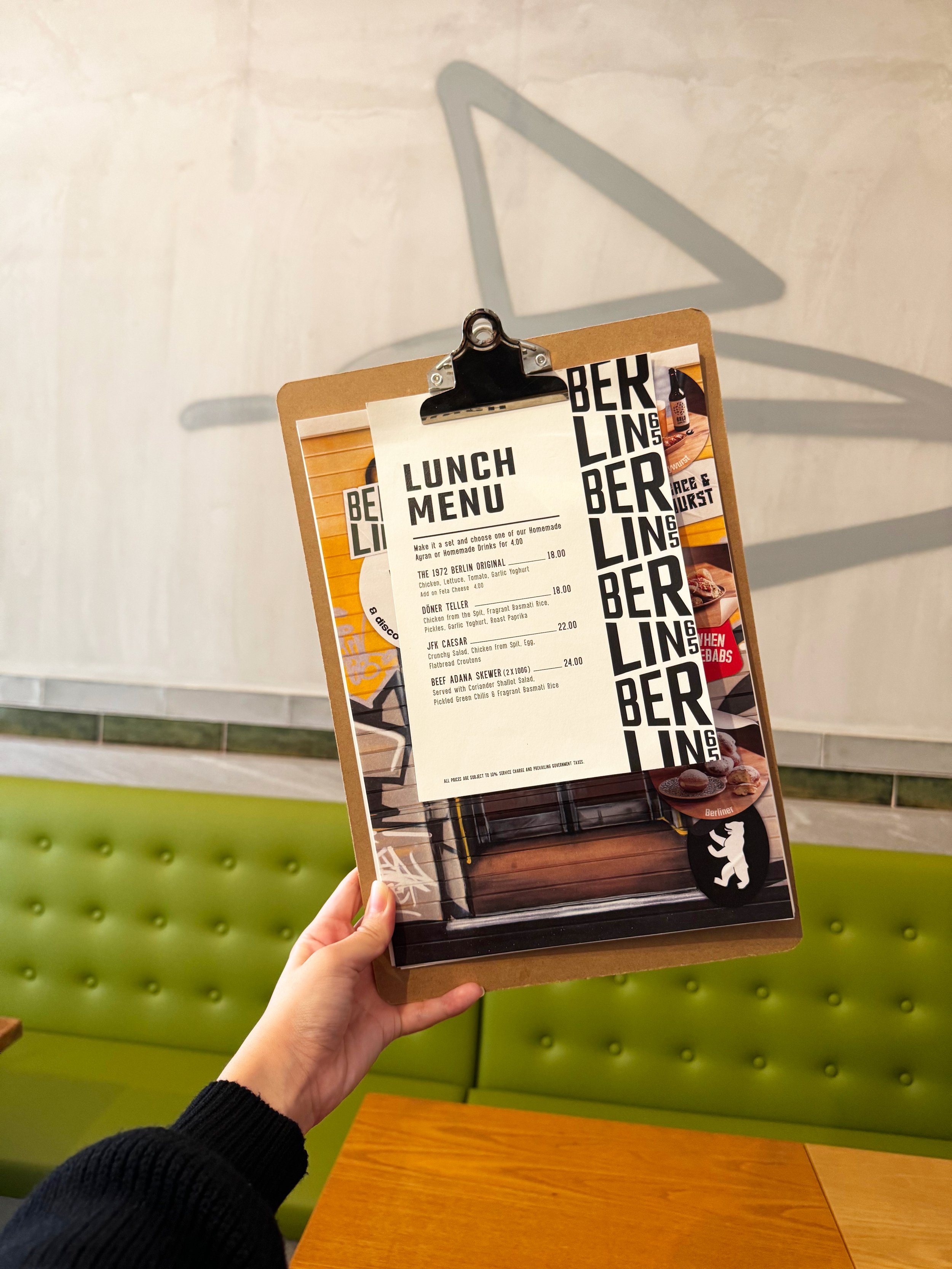
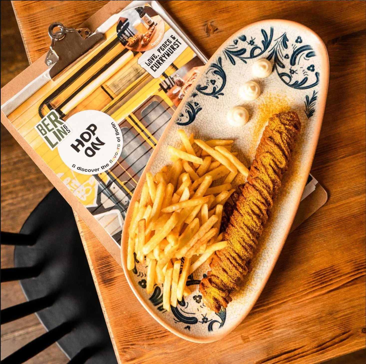
For Berlin65, I wanted the menu to feel like part of the environment itself. Inspired by Berlin’s grunge street culture and urban food scene, the idea was to design a menu that blends naturally into the restaurant experience while still keeping information clean, scannable, and easy to navigate.
Rather than using a conventional menu holder, the lunch menu was designed as a clipboard — borrowing visual cues from street posters, graffiti layering, and pasted urban notices often seen across Berlin streets. It is functional, tactile, slightly rough around the edges. Combined with the logo motif as a repeating pattern, even the physical experience of ordering felt consistent with the Berlin street aesthetic.