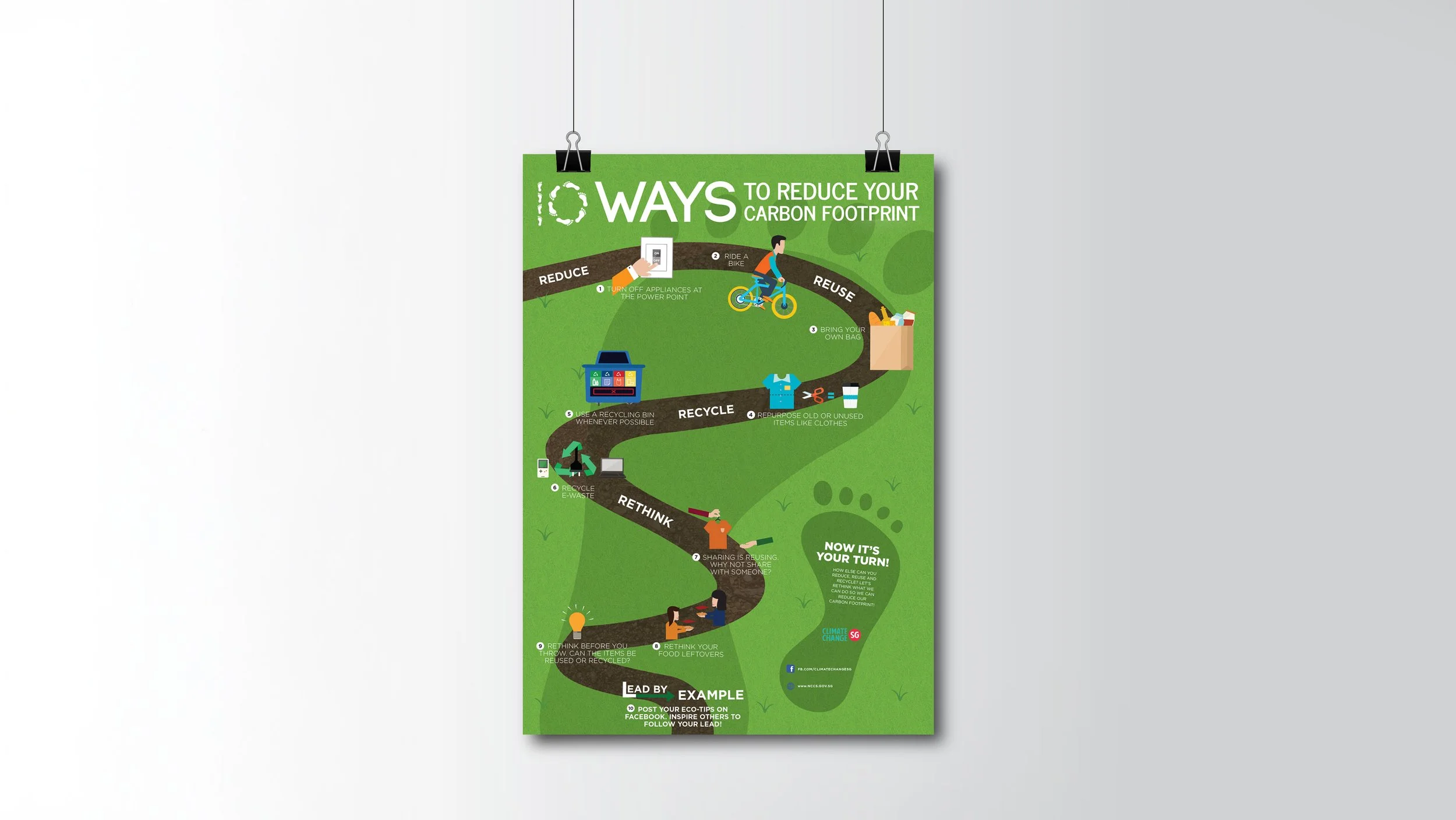
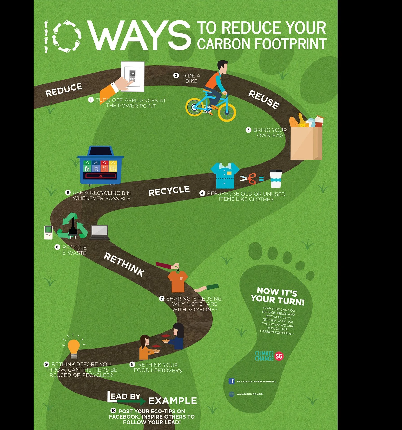
10 WAYS TO REDUCE YOUR CARBON FOOTPRINT
An NCCS infographic campaign designed to simplify climate awareness through approachable visual storytelling and bite-sized educational content.
BRIEF
NCCS required a digital infographic that communicates practical ways individuals can reduce their carbon footprint in their daily lives. The content needed to be educational, visually engaging, and easily adaptable across both website and social media platforms.
The challenge was to translate an information-heavy sustainability topic into content that felt approachable, digestible, and encouraging rather than overwhelming.
Client: National Climate Change Secretariat (NCCS)
Role: Visual Communication, Infographic Design, Art Direction
Deliverables: Infographic Poster, Social Media Assets
DESIGN APPROACH
Turning sustainability education into a guided visual journey
Rather than presenting information as dense blocks of text, the infographic was designed as a visual pathway that leads users through 10 simple lifestyle actions step-by-step. The winding route structure was intentionally created to mimic a journey, encouraging users to progressively explore each action while reinforcing the idea that reducing carbon footprint is built through small everyday decisions. This helped transform environmental messaging into a more approachable and action-oriented experience.
INFORMATION HIERARCHY
Designing for quick scanning and readability
As the infographic contains multiple educational points, information hierarchy became a key design consideration.
Typography, spacing, and icon placement were carefully structured to:
break down information into manageable sections,
guide visual flow naturally,
and improve content discoverability.
The layout prioritises quick comprehension, allowing users to understand each sustainability tip within seconds while maintaining engagement throughout the entire infographic.
ART DIRECTION & VISUAL COMMUNICATION
Creating an approachable and optimistic tone for climate awareness
The visual direction focuses on simplicity, clarity, and accessibility to make the topic feel less intimidating for a broad public audience.
A predominantly green colour palette was used to reinforce themes of:
sustainability,
renewal,
nature,
and environmental responsibility.
To avoid the visuals feeling overly serious or technical, the illustrations were designed using flat vector graphics, soft shapes, and clean iconography. This lighter visual treatment creates a friendlier and more optimistic tone while improving readability across digital platforms.
Each illustrated action was intentionally simplified into recognisable daily habits — such as cycling, recycling, switching off appliances, and reducing waste — allowing users to quickly scan and absorb information with minimal cognitive load.
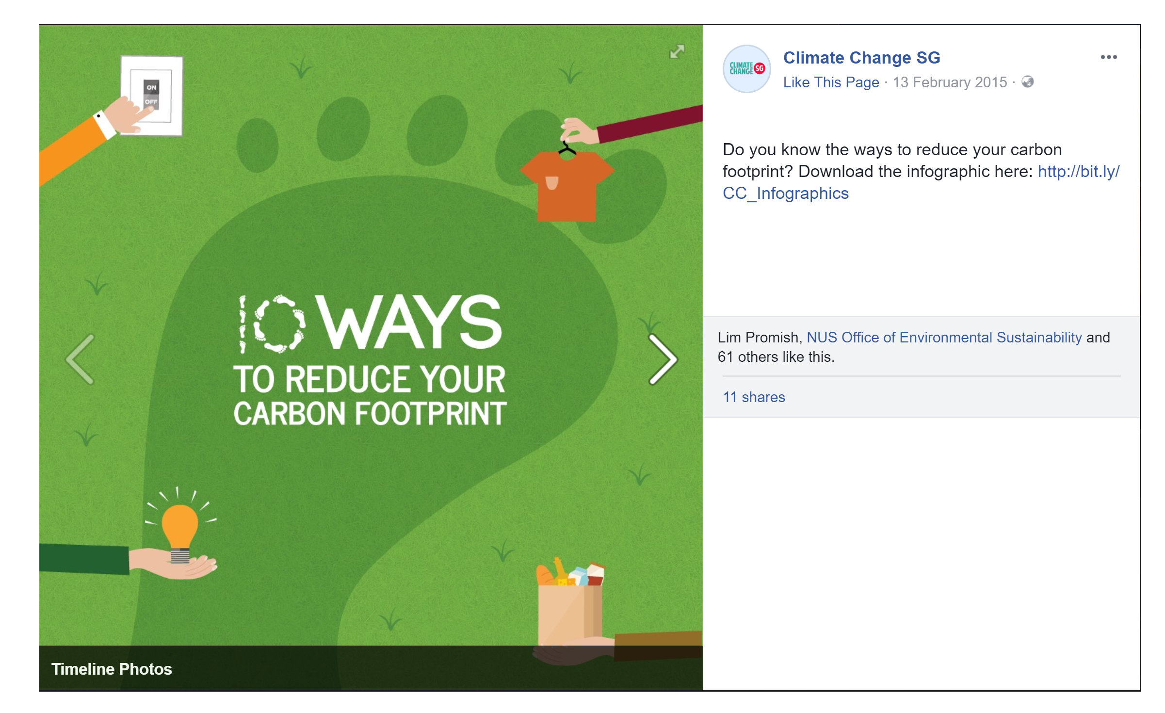
SOCIAL MEDIA ADAPTATION
Extending awareness through bite-sized digital content
To increase accessibility and reach, the infographic system was adapted into a series of social media assets for Climate Change SG’s digital platforms.
Key visuals and messaging were reformatted into smaller, scroll-friendly compositions optimized for social engagement while maintaining visual consistency with the main infographic.
This modular approach allowed the campaign to communicate sustainability messages across different touchpoints while remaining cohesive as a larger awareness initiative.
OUTCOME
Making sustainability messaging more approachable
By combining visual storytelling, simplified information hierarchy, and approachable illustrations, the project transformed a complex environmental topic into a more accessible and engaging public education experience.
The final deliverables helped communicate climate-conscious habits in a format that feels:
clear,
actionable,
and visually inviting for everyday audiences.
REFLECTIONS & TAKEAWAYS
Designing clarity for public communication
This project reinforced the importance of balancing education with accessibility when designing public-facing information systems.
I learned how thoughtful visual hierarchy, simplified illustrations, and structured storytelling can significantly improve how users process informational content — especially for topics that may otherwise feel overwhelming or technical.
The project also highlighted how design can encourage behavioural awareness by making complex issues feel more relatable and actionable through everyday visuals and interactions.