SKECHERS — MULTI CHANNEL BRAND & CAMPAIGN DESIGN
Designing cross-platform brand experiences that translate Skechers’ sporty and playful identity into engaging retail, digital, and experiential touchpoints.

OVERVIEW
During my time at Skechers, I worked across multiple campaign touchpoints ranging from social media content and retail promotions to experiential activations and custom merchandise.
The role required balancing brand consistency with fresh creative concepts across different collections, audiences, and seasonal campaigns. Beyond visual execution, the projects also involved understanding customer behaviour, retail engagement, and how design influences product visibility both online and in physical environments
THE CHALLENGE
Designing for multiple touchpoints while maintaining a cohesive brand identity
Skechers caters to a wide demographic across lifestyle, sports, fashion, and casual wear. Each campaign required a distinct visual direction while still remaining recognisable as part of the Skechers brand ecosystem.
The challenge was not only creating visually engaging assets, but also designing campaigns that:
attract attention quickly in retail environments,
resonate with different target audiences,
and adapt consistently across physical and digital platforms.
This required balancing marketing objectives, product storytelling, and user engagement across varying formats such as MRT ads, social media, in-store displays, event spaces, and merchandise..
Role: Creative Designer
Scope: Social Media, Retail Campaigns, OOH Advertising, Event Activations, Packaging, Custom Merchandise, EDMs
Deliverables: Digital Campaigns, Store Visuals, Promotional Posters, Event Assets, Patch Designs, Product Photography
OUT-OF-HOME ADVERTISING
Designing for high-traffic commuter environments
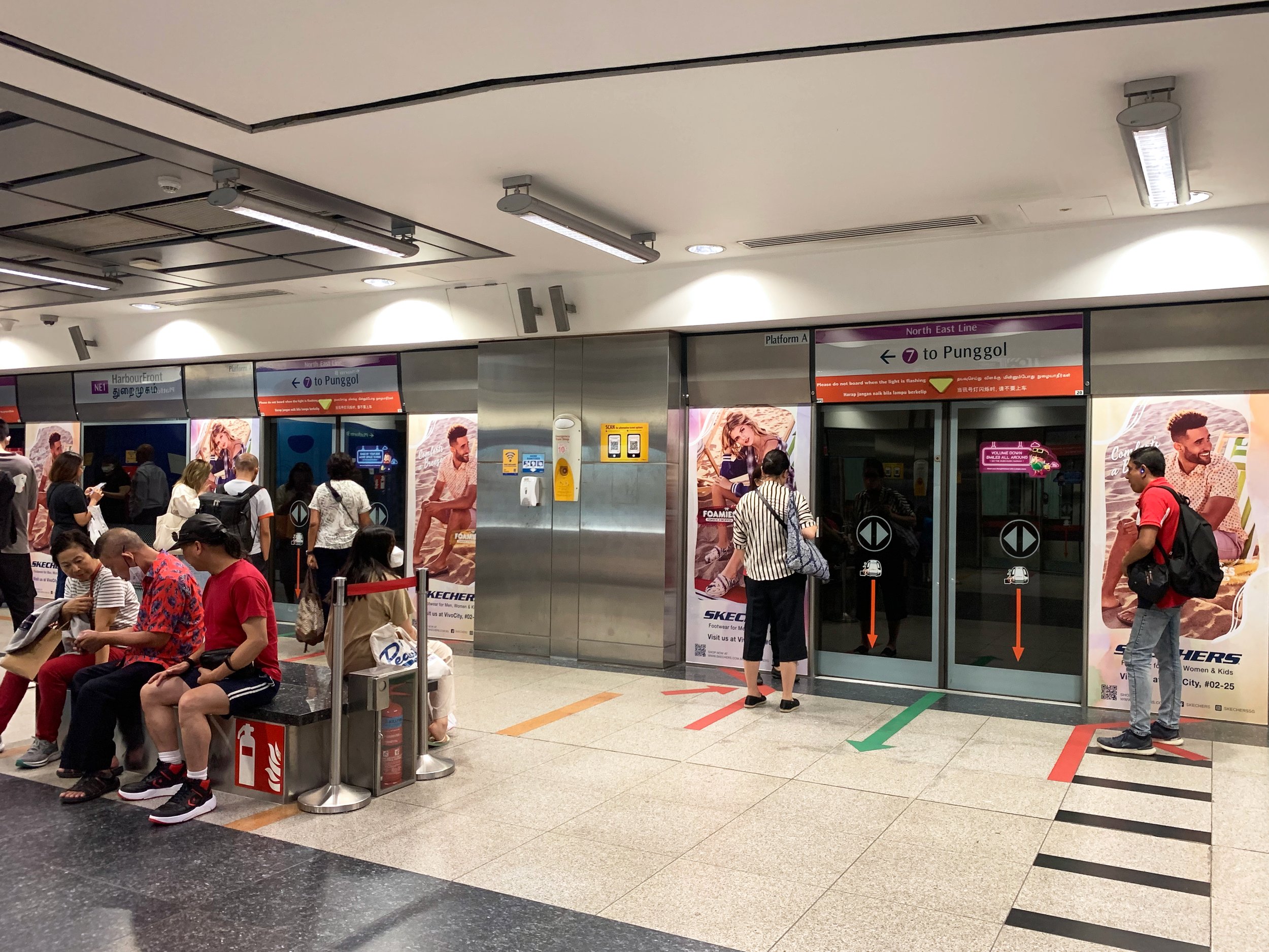
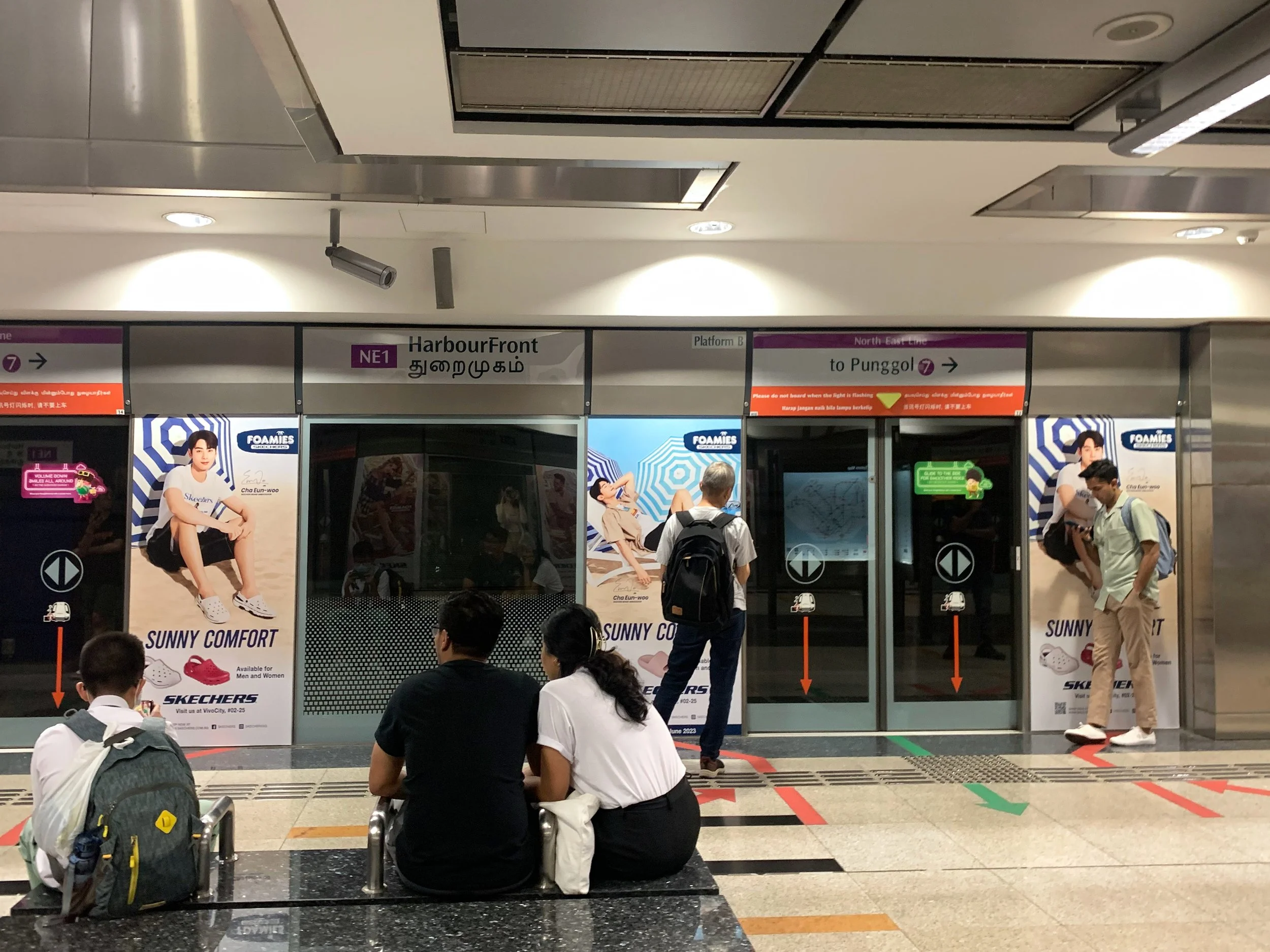
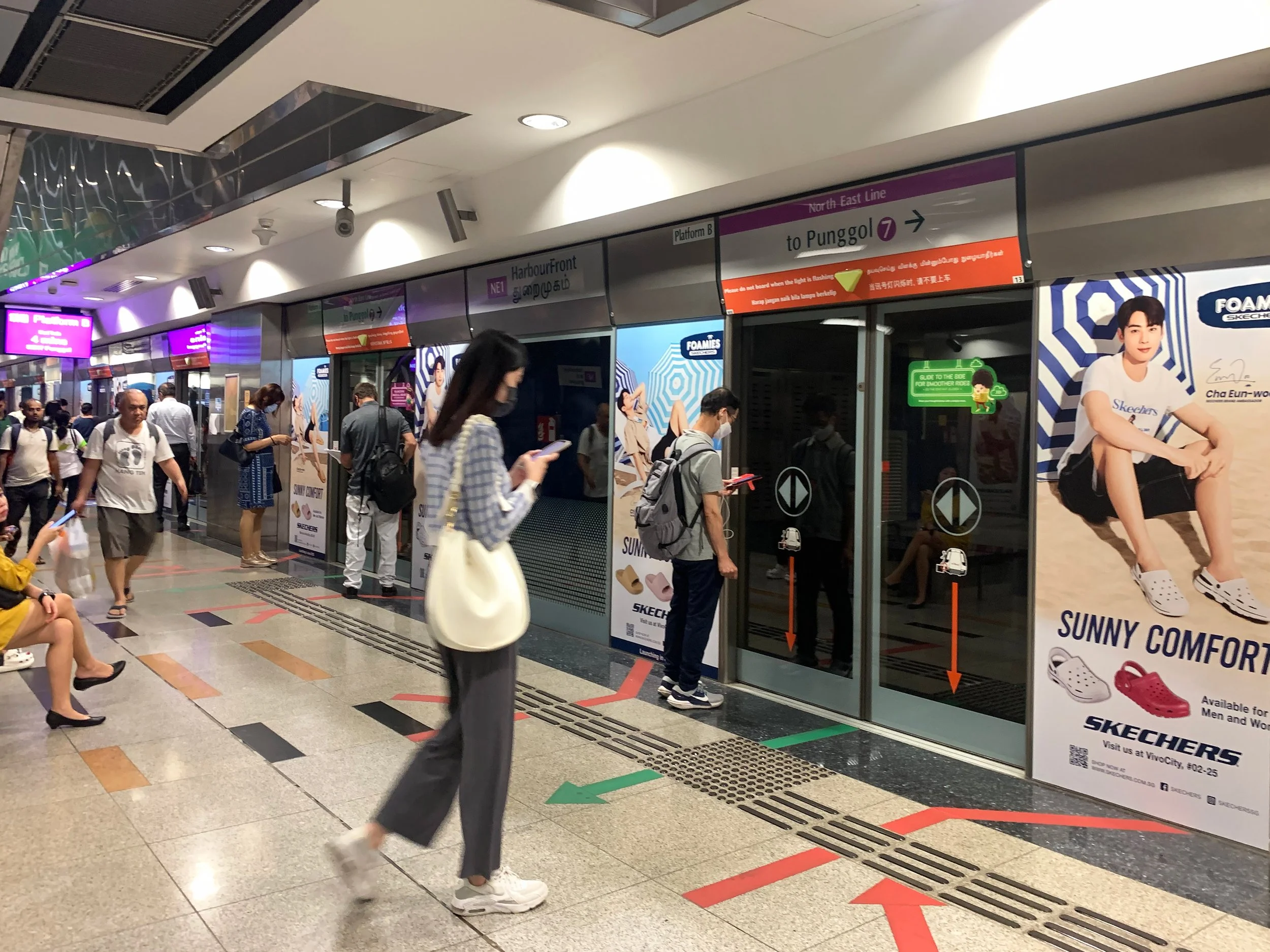
Worked on various outdoor advertising assets across MRT stations, malls, and digital media placements.
Unlike digital platforms where users actively browse content, OOH advertisements rely heavily on quick readability and immediate visual impact due to short viewing durations and commuter movement. As a result, layouts were designed with:
strong focal hierarchy,
large promotional messaging,
bold colour contrasts,
and simplified communication structures.
The goal was to maximise visibility within crowded commuter environments while ensuring the campaign remained visually aligned with Skechers’ energetic and lifestyle-driven branding.
EVENT ACTIVATION
Extending the brand experience into physical interactions
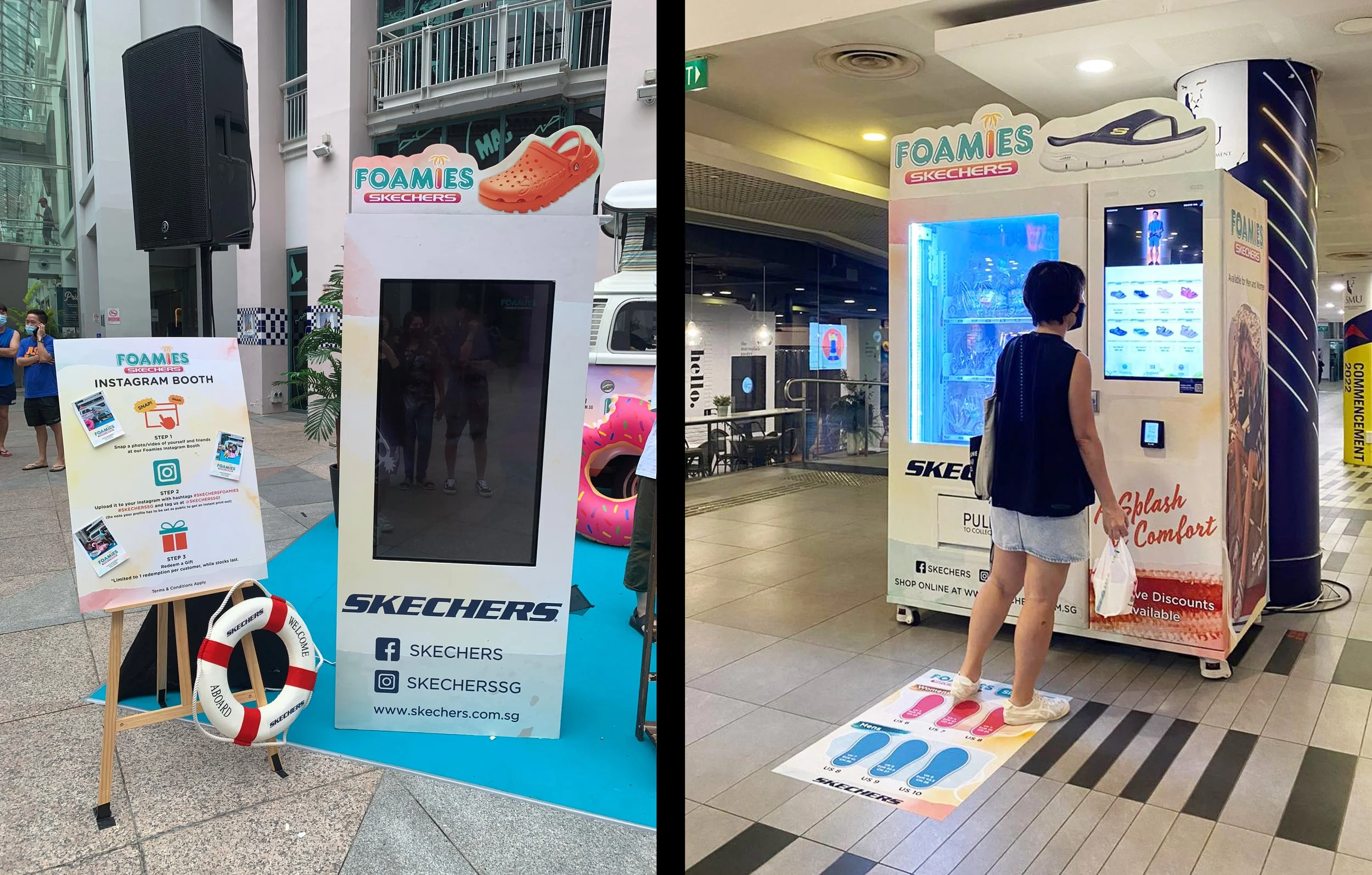
For pop-up events and retail activations, I helped curate booth graphics, vending machine visuals, photobooth experiences, and supporting promotional assets.
One notable activation involved a Foamies vending machine installation targeted at younger audiences within campus environments. The activation combined playful visuals, interactive touchpoints, and promotional mechanics to encourage both engagement and product discovery.
This project reinforced how physical experiences can strengthen brand recall by transforming campaigns into memorable interactions rather than static advertisements.
SKECHERS × KIND KONES
Translating product identity into collectible brand merchandise
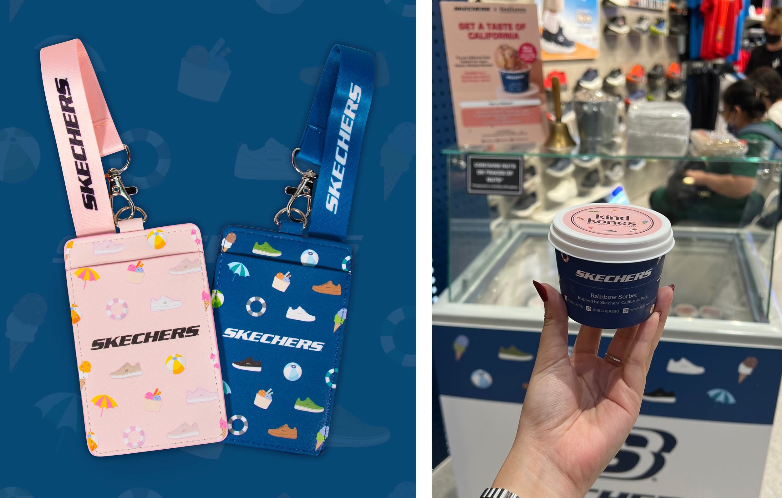
This collaboration campaign introduced limited-edition cardholders and lanyards inspired by the “California Pack” collection.
The visual direction draws heavily from California summer culture, combining beach-inspired graphics, playful illustrations, and vibrant seasonal colours. To better reflect the different shoe collections:
warmer pink and pastel tones were used for women’s designs,
while cooler navy and blue palettes reflected the men’s series.
Elements such as beach balls, umbrellas, ice cream, and coastal motifs were intentionally incorporated to reinforce the collection’s relaxed summer aesthetic. The artwork was later extended across ice cream packaging, store displays, and promotional collaterals to create a cohesive campaign identity across touchpoints.
CUSTOM-MADE PATCHES
Creating localised designs inspired by Singapore culture
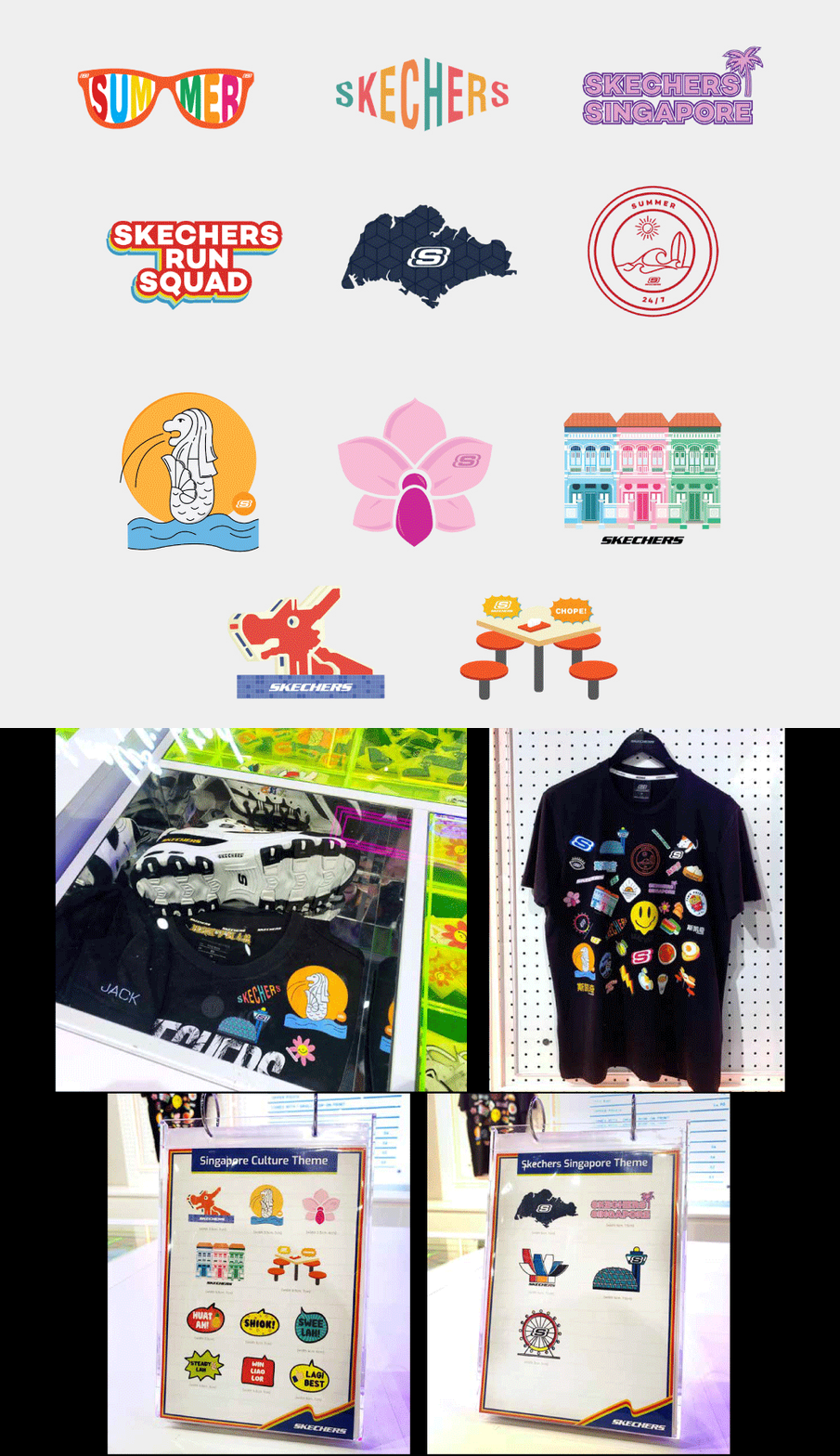
For Skechers’ customisation zone at Jewel Changi Airport, designed a series of collectible patches inspired by Singapore culture, landmarks, and local lifestyle elements.
The challenge was translating recognisable Singaporean references into simplified illustrations that still felt playful, youthful, and aligned with Skechers’ visual identity. The collection included themes such as:
Peranakan shophouses,
the Merlion,
dragon playgrounds,
hawker “chope” culture,
local slang,
and summer-inspired Singapore visuals.
Bright, saturated colours and simplified vector illustrations were intentionally used to reflect Singapore’s vibrant energy while making the patches visually adaptable across apparel, accessories, and footwear.
This project highlighted the importance of localisation in creating stronger emotional connections between brand experiences and audiences.
MONTHLY RETAIL CAMPAIGNS & GONDOLAS
Designing for visibility within competitive retail spaces.
A part of my role involved creating monthly promotional posters, gondolas, and campaign visuals used across retail stores and atrium sales. Retail environments require immediate visual communication, especially when multiple brands compete for attention within the same space.
The designs therefore focused heavily on:
bold typography,
strong promotional hierarchy,
seasonal visual storytelling,
and colour systems that attract attention from a distance.
The campaigns were also adapted across websites, social media, and mall advertisements to ensure visual consistency throughout the customer journey.





DESIGN APPROACH & CREATIVE THINKING
Blending branding, user engagement, and visual storytelling
Across these projects, my approach consistently focused on understanding:
how users interact with physical and digital brand spaces,
what visually attracts attention within crowded environments,
and how design can strengthen emotional engagement with products.
Working across multiple formats also strengthened my ability to:
adapt visual systems across platforms,
balance business and user goals,
and create experiences that remain cohesive across the full customer journey.
REFLECTIONS & TAKEAWAYS
Designing beyond aesthetics
These projects reinforced that strong visual design is not only about aesthetics, but also about understanding behaviour, context, and interaction. Whether designing for commuters rushing through MRT stations, shoppers browsing retail stores, or audiences scrolling social media, each design decision needed to support:
visibility,
usability,
emotional engagement,
and brand storytelling.
The experience also deepened my understanding of how creative direction, visual communication, and user behaviour intersect to shape memorable brand experiences across both physical and digital touchpoints.